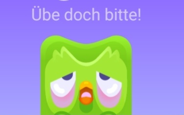
So you’ll open the app. Duolingo has changed the icon previously for the same reason. It makes people curious, so they open the app to see if anything is different.
https://www.digitaltrends.com/mobile/why-is-duolingo-melting-app-icon-explained/
And, like a vampire, you’ve then invited the bird back into your life for a couple of weeks
@halcyoncmdr @Roccobot I was feeling I should get back into my language learning but can’t bring myself to interact with that sick bird.
i hope they change the icon so I feel inspired to use their product again.
Duolingo is actively and nefariously designed around making you feel the need to open it.
It works, I’ve been doing it for 3 years and a half without skipping a day (but I got better with the language!)
Here my favorite.

Tfw you have custom icon packs installed so this marketing bs doesn’t reach you
He’s tired from all that teaching.
Because it’s a hell of a drug
@Roccobot That’s cool. I have never seen this icon before. But also I’m on Android, and I know the ios version is better
I’m on Android too


