You must log in or register to comment.
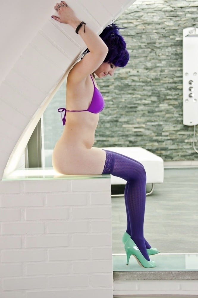
The impact of this photo would have been so much better if she also had a violet bikini top. The lavender/violet color clash hugely takes away from the shot imo
Teal to match the shoes would give it a nice symmetry as well, but I agree the hues clash more than they harmonize. I also find myself wishing I could reframe the shot, like, I can see the Fibonacci spiral the photography might have been going for, but it’s really claustrophobic. It almost feels like the white crowds out the other points of interest in the shot.
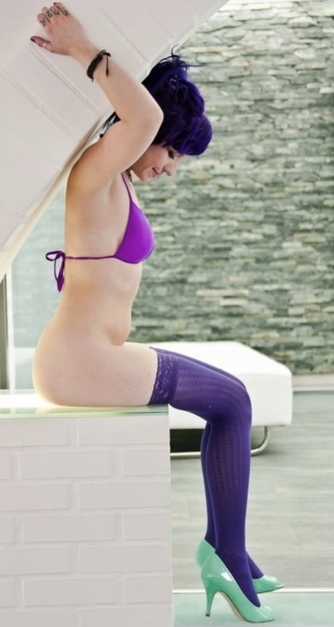
I wanted to play with the framing a bit and this is what I landed on (A slight diamond frame could be fun here, especially with the curve to lead the eye around, but there just isn’t anything on the top of the frame to work with… ):
I don’t really think there was any saving the cyan shoes with any shade of purple, but that’s just me. I saw your edit and I do agree reframing it helps a little because the very white on white background is also a bit cluttered.
It just bums me out because this had the potential to be a phenomenal shot, but it falls short because of some minor decisions.