- cross-posted to:
- stonersandgamers@lemmy.ca
- cross-posted to:
- stonersandgamers@lemmy.ca
Yes, it’s yet another app for Lemmy.
Based heavily on the abandoned Lemmur project, with a few updates to make it run with the current API and some minor changes to the UI.
Written in Flutter, so although it’s only available for iPhone and iPad right now, it does run on macOS and Android so releases for those platforms may be on their way.
I will be releasing the source once the app has gone through this beta testing phase.
Let me know here of any issues or in the TestFlight build (long press on the icon). Once I’ve opened the source we can start using GitHub to track issues.
KNOWN ISSUES:
- The app occasionally forgets who you are and mistakenly nags you to log in when trying to comment or vote.
Developers: interested in helping out? Experienced with Mobx, Provider and Freezed? Let me know!
Features:
- Full featured for end users
- Light Mode, Dark Mode, System Mode
- Multiple accounts on multiple servers
- Localisation (work in progress)
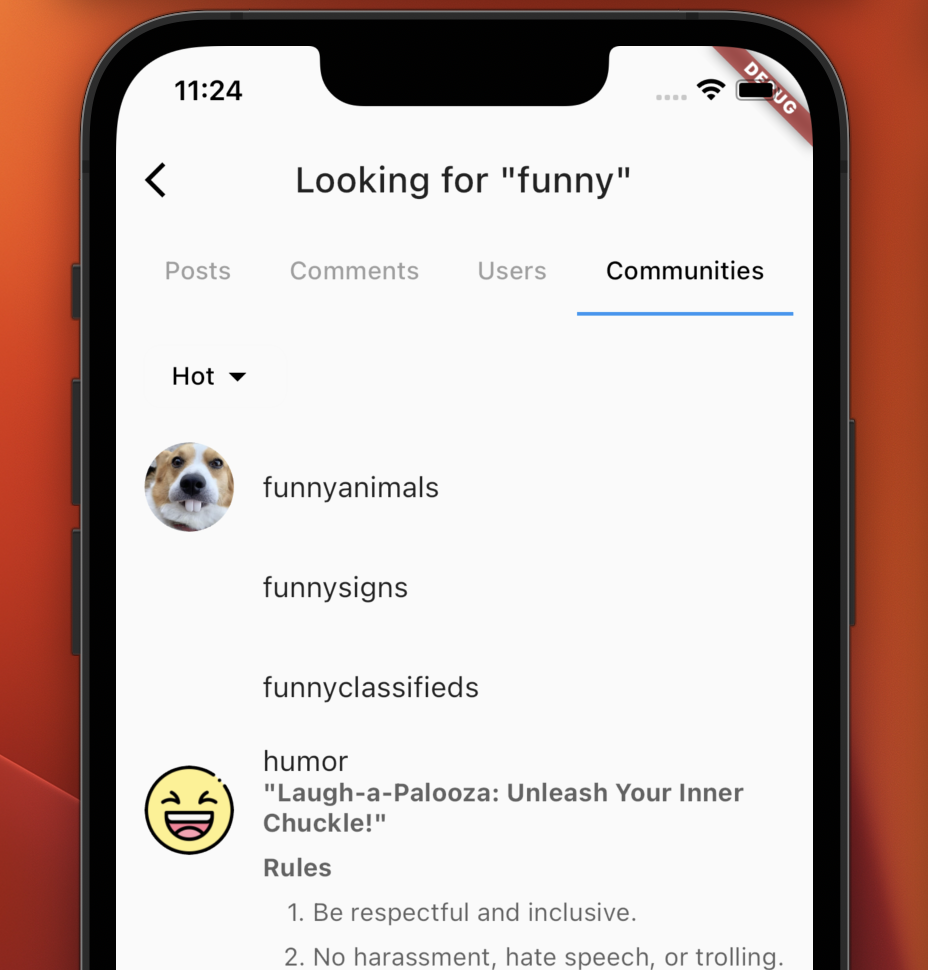
- Full search support (posts, comments, users, communities)
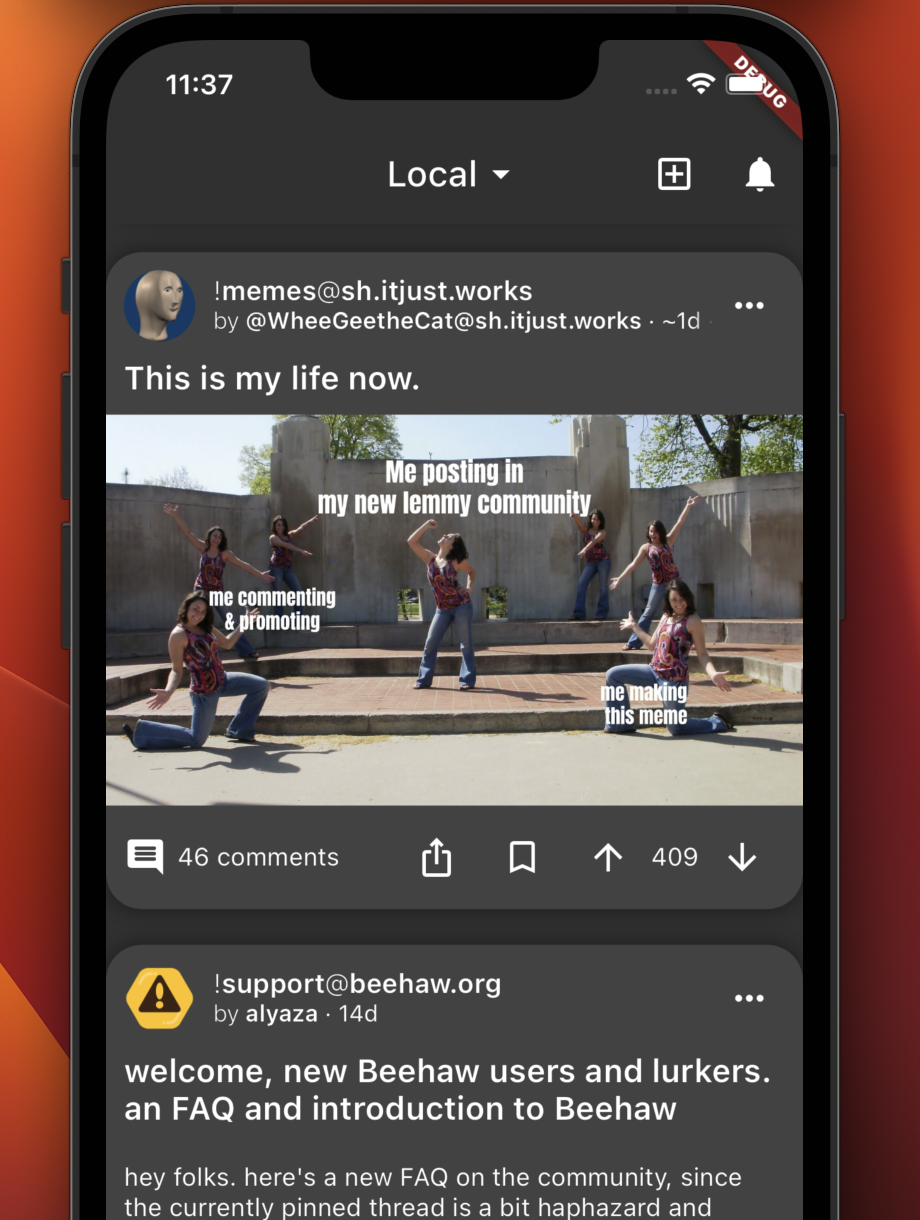
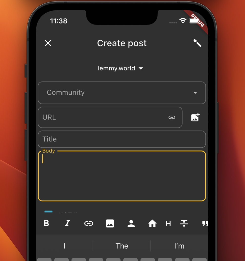
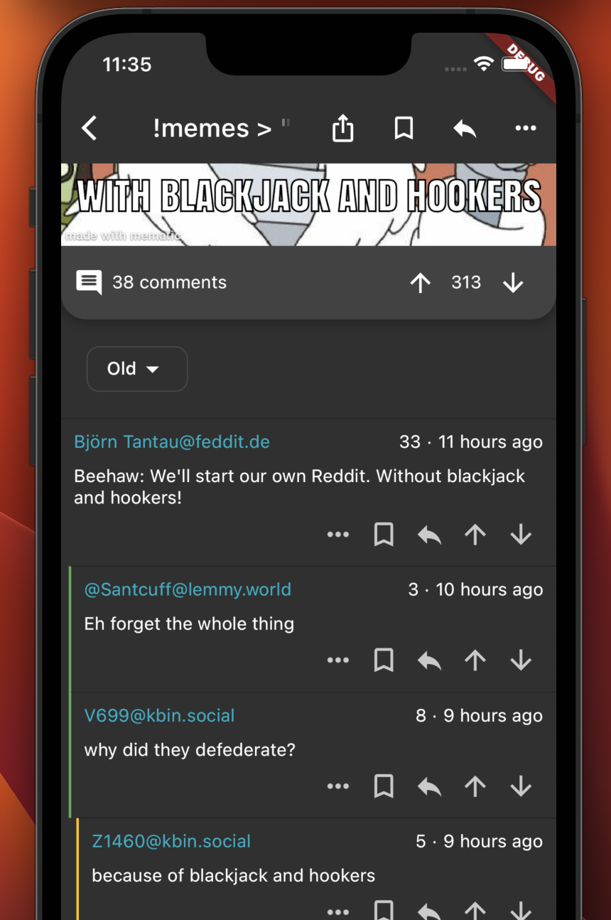
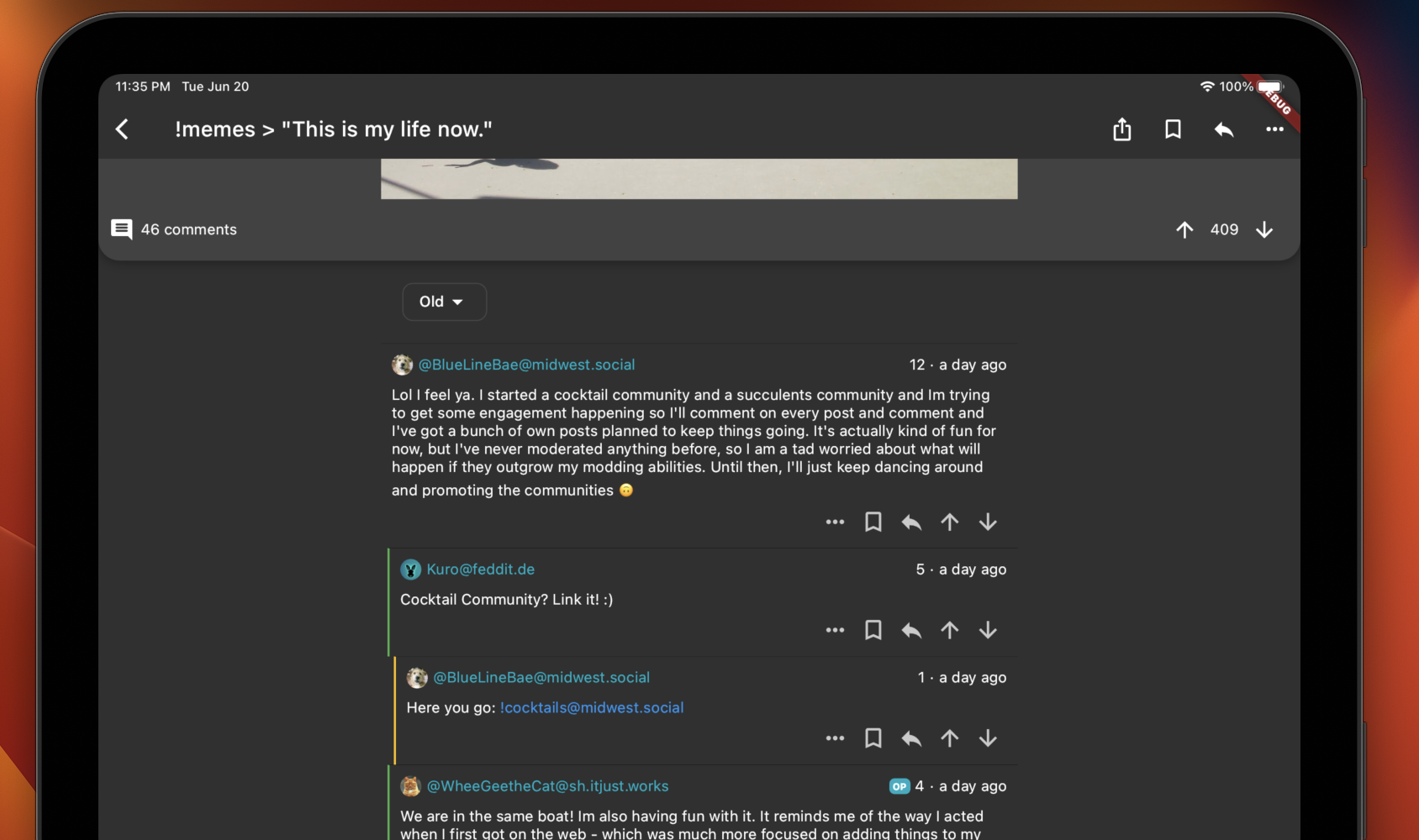
A few screenshots to whet your appetite:
On behalf of The Mlem Team, welcome to the club ;)
Haha, I’m also
stealing ideas frombeta testing Mlem!
This 👏 is 👏 amazing 👏
Hey so I’m really liking it so far, looks great, love the styling and all, but scrolling through the feed is a little stuttery. I did a screen recording, not sure if you can even see what I’m referring to in the recording as it seems so subtle there, but when using it on my iPhone it feels really jarring. Wonder if it’s because I have a 120hz iPhone, not sure if Limbo supports or accounts for the 120hz devices?
Either way it doesn’t feel great to scroll at the moment:
Yes, I don’t think the original devs could ever have seen a post with more than a handful of comments. As soon as they mount up we do start to have issues. It will be a priority are for Liftoff! (see announcement here!)
So far so good! Functionally, I think it’s one of the best ones on IOS now (testing Mlem and Memmy as well).
The only think I’m not crazy about is the UI styling… The rounded boxes with shadows for posts are looking pretty weird (maybe just a little bit spacing between the edge for some room to breathe?). Otherwise I’m a fan of simple boxed approach.
Anyway, keep up the good work and keep them updates coming! 😀
Yeah I think there’s some UI thinking to be done. I just want to ensure that the functionality all works as intended first!
Hi! This is great, could this be worked as a team with zach who’s making an android version based on the same code?
That’s great, thanks for pointing me to him, I’ll get in touch!
Looks promising. Feels much better than Mlem.
Oh I’m sure Mlem will catch up very quickly 😀
All these apps keep getting significantly better almost every other day.


