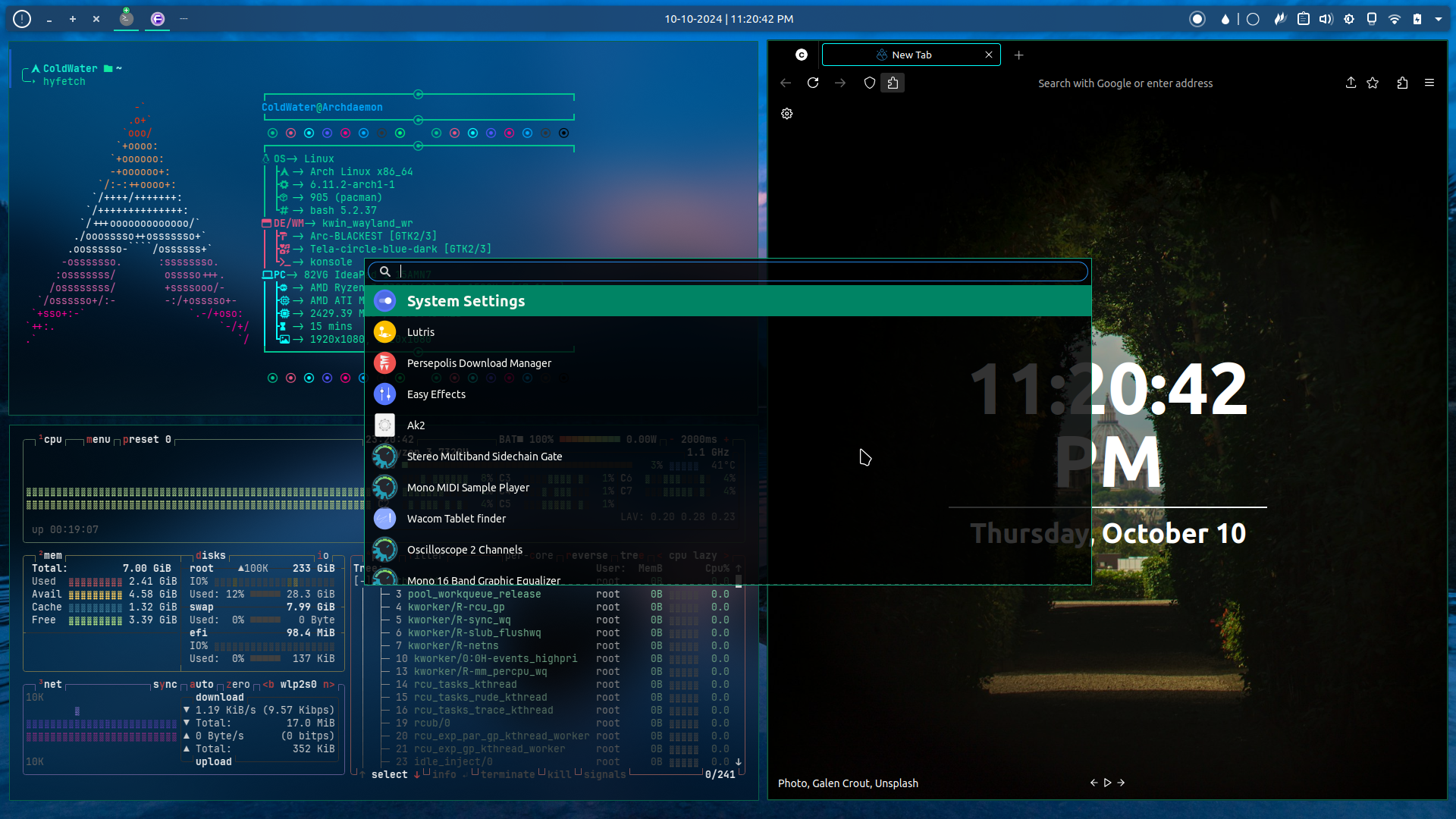
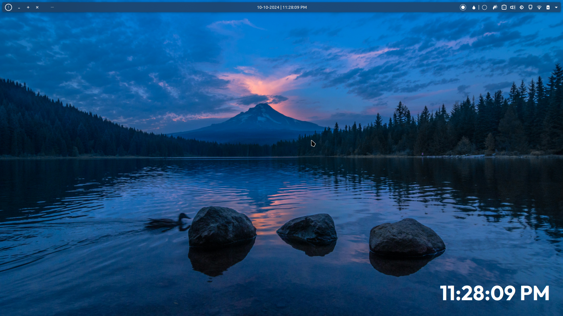
it’s look
Agreed: it is look.
The biggest thing of that update is the new option for colour blind people and sticky keys. Sadly Linux lacks a lot of accessibility options, so that update is a very welcome one.
What’s the name of that bar you’ve got on top?
Just normal KDE plasma panel and some widgets, (from left to right and all of these widgets are built in to KDE except “Application title bar” you can download it from KDE’s widget store): Notification, Application title bar (buttons only), Icon only task manager, Global menu, Application title bar(Name only), [Spacer] digital clock, [Spacer] Applications launcher, Colors picker, System trays
Thanks! I didn’t know I could do that on KDE
One of the things I’ve loved about KDE. You can legit do whatever the fuck you want. Gnome felt so constricted in that I needed others to code a extension for me
I know!! KDE is one of the reasons I never looked back when I left windows. And even to this day I keep learning new stuff, KDE really rocks
Wow, nice, looks great! What do you use for tiling, and hiding the window borders?
Thanks you, I’m not using any windows tiling I just arranged it manually but I think you can install one, for hiding boarders I just use this guide here TLDR: Navigate: System Settings -> Application Style -> Window Decorations
Click one of the themes context menu icon
Navigate: Window Specific Overrides -> Add
Click “Hide window title bar”
Use “.*” for the regular expression to match all windows
I noticed the task bar icons were looking even nicer now on 6.2. Maybe there are other changes too.
I’m a simple man. I see Tabliss, I like.
