I am sure asset sizes are subject to change depending on so many factors from app instances, to theming, etc. but I thought it would be useful to have a location where we can discuss asset sizing options the ensure good looking community headers, logos, etc.
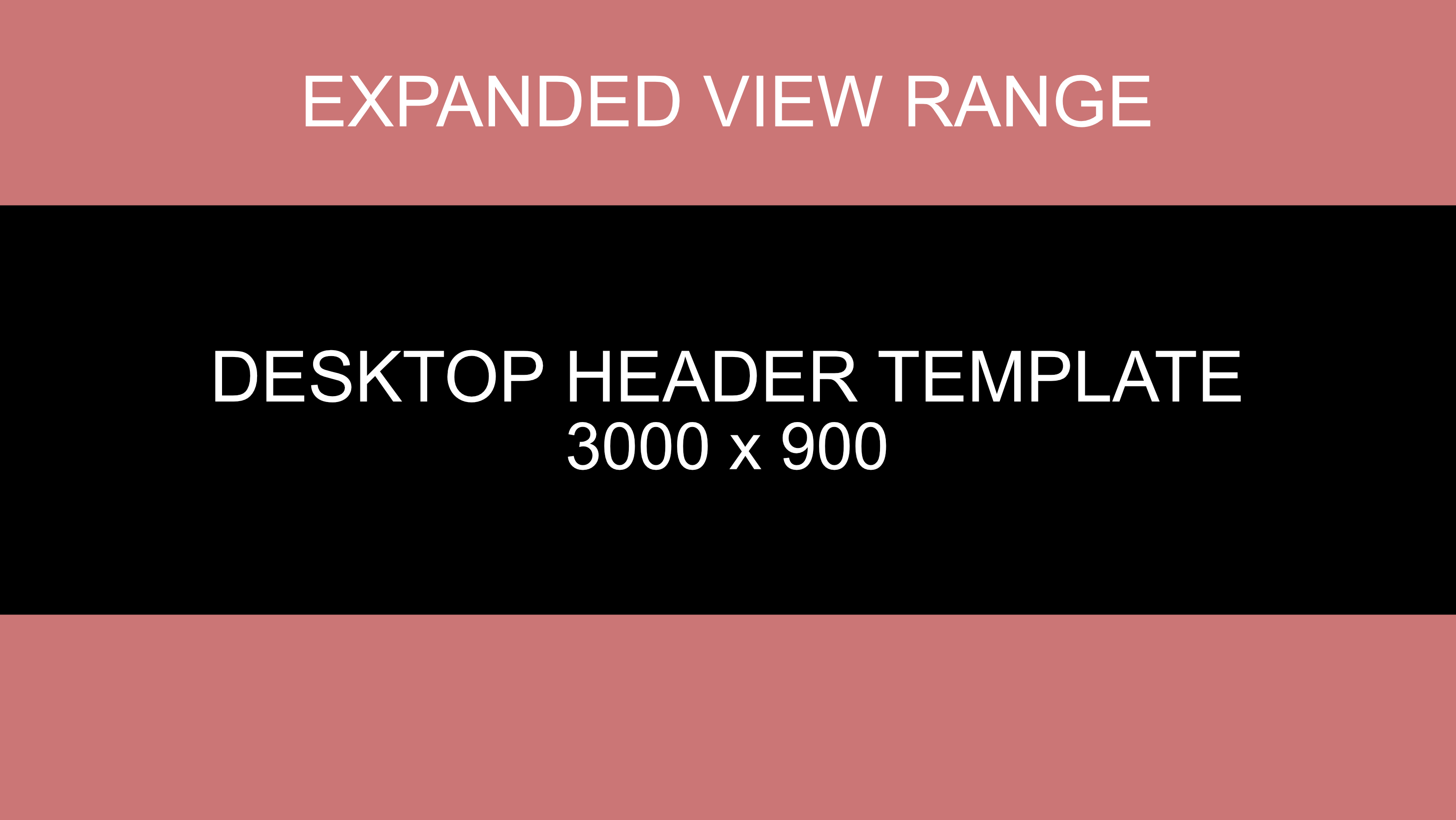
I have started by attaching this one, a desktop header. From what I can tell, the default sizing (visible area on standard desktop and mobile) are similar but there is an aspect of overflow when the dynamic resizing happens.
The attached image is 3200x1800 in full and the main ‘visible’ area is central at 3000x900. This means that header images should be designed with the core elements in that area. You can scale the image as required but hopefully this helps.

That’s great, thanks. We had a bit of a discussion about banner size here but didn’t reach any conclusions. That should prove very handy.
Cheers. I thought I had seen mention of banner sizes somewhere but could not remember where. Hopefully this does come in handy.
Yeah, I have searched for answers and found few so all.bits of the puzzle are welcome.
I suppose we are all collectively writing the user manual because everything is still so new and fast moving.


