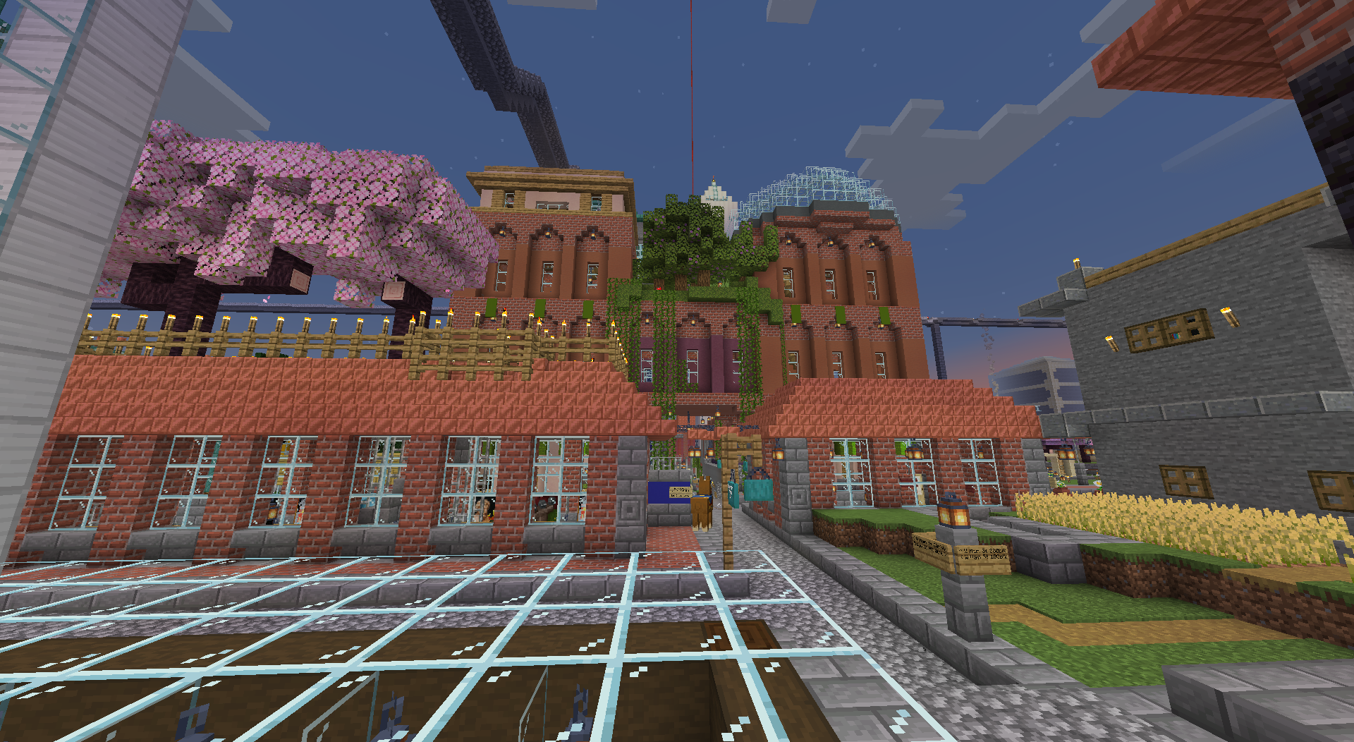
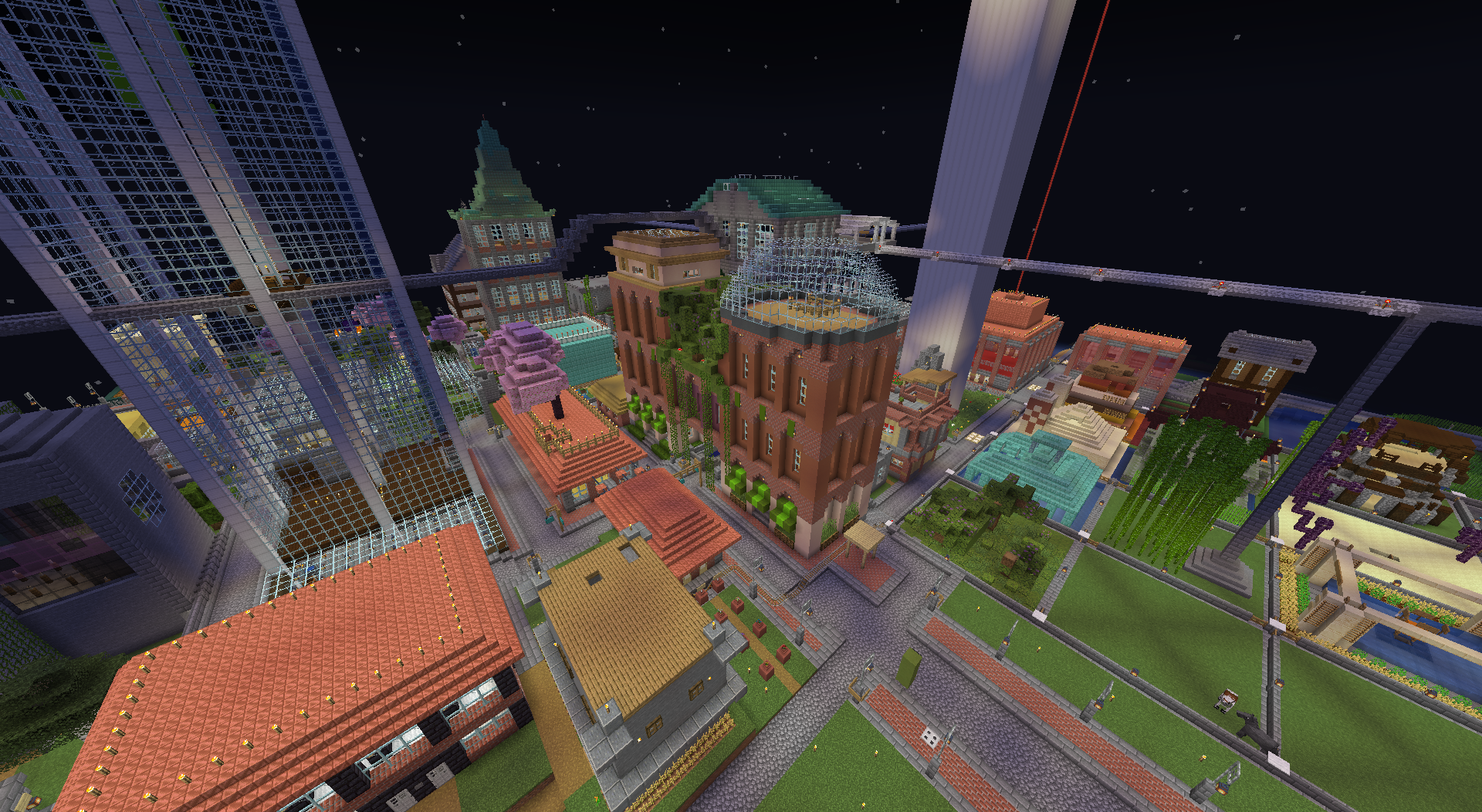
I felt that the asymmetry of the first extension (the purple part with green roof in the middle) was a bit too jarring and the support for that structure was questionable looking, so i added another section to even it all out and put an observatory dome on the top so that it didn’t look too symmetrical.


You must log in or register to comment.

