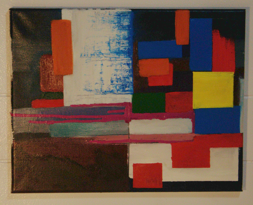
That image got really dark when I uploaded it, here’s a screenshot of it for better colors

Hahaha I made my post before I saw this.
Looks much better
I am a enjoyer of art but no critic. I very much like this style and I think you are well in your way. For me I actually preferred the image more when it was darker. I liked that the vibrancy was toned down and made me want to look closer and see the brush work and made me want to sit and stare and think. Great first outing.
On one hand it’s an amazing piece in both the dark and the light versions, on the other the bottom right side sort of loses something in the darker version. I feel like the minor difference adds something, even if it doesn’t draw the eye as much as the top half.
I’m not knowledge enough of the style to provide meaningful feedback. So take everything I say with a massive grain of salt.
I think it’s generally lovely and interesting to look at.
It feels a little top-heavy to me, though it’s not necessarily bad if it’s intentional. I think the yellow square heavily draws the eye and weights the space.
The dripping paint is a really interesting counterpoint, but it’s so gentle my eye tends to be drawn upward again, leaving the bottom right hand corner largely unexplored.
I think the use of texture is really good and creates interesting contrast that keeps me engaged with the piece.
As a first-time critic of the style to a first-time artist of the same, I think it’s really good and if you have the time and resources would benefit from exploring it further.
That’s a frank, honest, and rather helpful critique. At this stage of exploration here, much more could be discouraging, so that’s great!
To OP: The whole piece is a confident result of hours in this style, and clear focus on a few key elements of it. Keep working on those and try out new concepts within the style as you progress. Have fun, and keep up the good work! 🤌🏼
I genuinely appreciate the critique critique. I was aiming for authentic, encouraging feedback from a layperson perspective.
Removed by mod
So I’m guessing you’re going for a color field painting, like Mark Rothko or Piet Mondrian style yeah? If so, great job! You’ve captured this style very well. In my personal opinion, the ‘weight’ of the top half of the painting is a bit heavy or busy versus the bottom half. I would suggest turning the painting sideways or upside down and seeing if you like it.
So maybe like this:
Or like this:

This is actually very cool. It has quite a different vibe depending on orientation. The first alternate orientation feels much more grounded.
I guess I shouldn’t be surprised. Good photographers also use composition techniques like this all the time, for example.
I really like it upside down. I feel like it grounds the painting. It’s a very elegant suggestion
I feel like you may only be able to receive meaningful feedback if you mention your goals for the piece.
Honestly my only complaint is the picture is too damn dark. I fucking love this!
The op posted a lighter version in the comments, Check it out! It’s pretty great.
Cool! You missed a spot on the bottom left. Love it!
Can I ask how you did the blue and white bottom left square? I really like the effect you made with it, and I kinda wish it was more present throughout the rest of the painting, because it feels like all the drips and paint textures tend towards the bottom (which may be your intention, I wouldn’t know lmao) but it’d be kind of cool to more of that in the top half in more than just that red left-topmost rectangle. Basically what Im saying is I kind of like the texture interactions. (also after reading some of the comments here I realized the thickness of the medium shows more in the dark version than the light version, I’m guessing you painted the other shapes over a canvas you gave once over with the darker paint first?) That being said some of the color interactions are only visible in the lighter version so I can see why you posted the other one!
