People upvote because they like the content of the data or how it supports their agenda, while forgetting that this community is supposed to be about judging the representation of it specifically. And that’s assuming they’re even paying attention to the community name in the first place, which many may not be.
It’s been a perennial issue both here and in r/dataisbeautiful as long as I can remember.

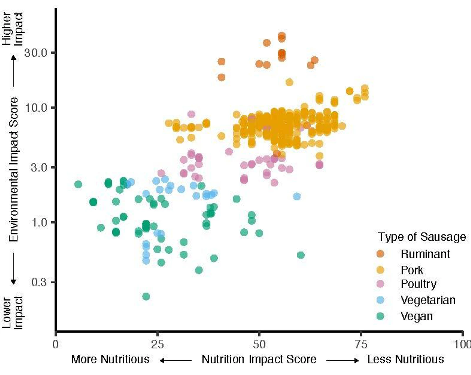
X = 100 → zero nutritious?
Why inverted?
Hope this helps:)
(The chart legend seems not to be placed properly, maybe that’s why they mirrored the chart.)
Oi, I noticed the vertical axis is logarithmic, the impact difference is bigger than I thought.
Thanks :)
I feel that a lot of posts lately have been very “ugly” in terms of data representation. Dunno what that’s about, or if it’s just me.
People upvote because they like the content of the data or how it supports their agenda, while forgetting that this community is supposed to be about judging the representation of it specifically. And that’s assuming they’re even paying attention to the community name in the first place, which many may not be.
It’s been a perennial issue both here and in r/dataisbeautiful as long as I can remember.
Try finding a genuinely oniony story on /r/nottheonion and not just a funny news article
Well, isn’t that how it’s also done on the reddit sub by the same name for years?