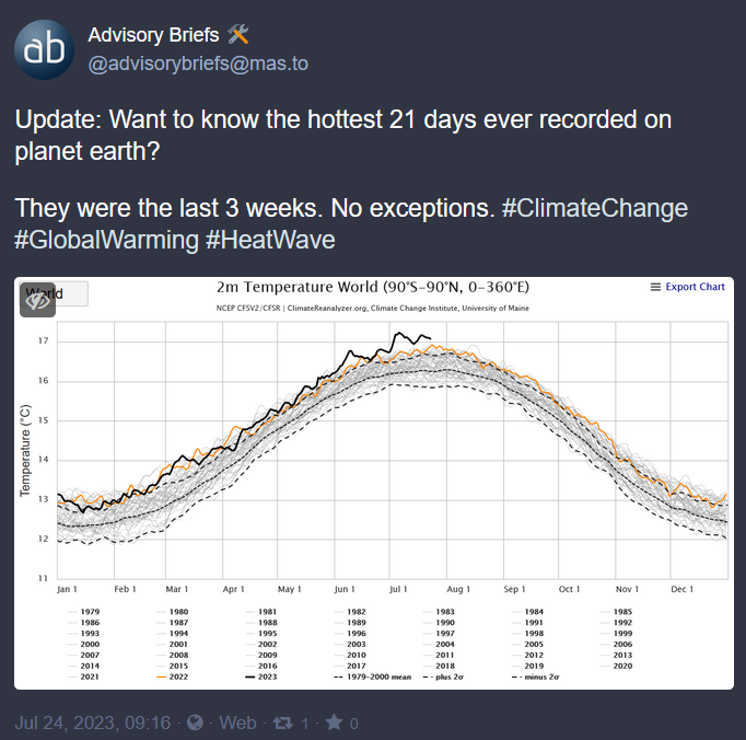
Even if it were the hottest 3 weeks in the last 44 years, it’s still the top 3 out of 2288 or so.
However, it’s not the hottest 3 weeks (which would be an average of 7 days each). It’s the hottest 21 individual days. Each and every single one of them. The top 21 out of 16060 all happened consecutively, “now”. I don’t get how much more “dramatic” it needs to get before people like you understand what’s going on.
You’re right, this chart is wrong and there is absolutely nothing to worry about.
Ecosphere collapse amid the 6th mass extinction event in our geologic record is all a sham to sell…something?
Hottest 3 consecutive weeks. Not, oh there were three weeks spread randomly throughout the year that were quite warm. It was starting from the beginning and going on continuously to the end, every single day was hotter than the previous for three weeks continuously.
And it’s worth pointing out that the graph can actually go back a lot further than 44 years. It’s just that we don’t have data yearly for prior to that point. What we have is from ice cores, which are unreliable at targeting periods of less than about a century, but we do know that the climate has been steadily getting hotter over that period as well.
So we have two data sets we can stick together, one taken every hundred years or so, the other taken every year, but if both were shown in the same graph climate change denyers would jump up and down on the discrepancy, despite it not actually being an issue.
Roughly 500 years ago, maybe more. Recordings are spotty up to the 19th century. Monestaries often had a daily log of current weather, for example. There are likely recovered observations going back to Greek or Roman civilizations.
Average temperatures can be deduced from scientific observations of ice cores and geological records as well. The arctic and antartic ice cores revealed detailed oxygen, carbon dioxide, and particulate data going back a couple million years.

When did the recordings start?
1979… Is the reading from the graph… I would guess that this is what the title refers to
Hottest three weeks in the last 44 years doesn’t sound as dramatic does it
Even if it were the hottest 3 weeks in the last 44 years, it’s still the top 3 out of 2288 or so.
However, it’s not the hottest 3 weeks (which would be an average of 7 days each). It’s the hottest 21 individual days. Each and every single one of them. The top 21 out of 16060 all happened consecutively, “now”. I don’t get how much more “dramatic” it needs to get before people like you understand what’s going on.
You’re right, this chart is wrong and there is absolutely nothing to worry about. Ecosphere collapse amid the 6th mass extinction event in our geologic record is all a sham to sell…something?
Removed by mod
Hottest 3 consecutive weeks. Not, oh there were three weeks spread randomly throughout the year that were quite warm. It was starting from the beginning and going on continuously to the end, every single day was hotter than the previous for three weeks continuously.
And it’s worth pointing out that the graph can actually go back a lot further than 44 years. It’s just that we don’t have data yearly for prior to that point. What we have is from ice cores, which are unreliable at targeting periods of less than about a century, but we do know that the climate has been steadily getting hotter over that period as well.
So we have two data sets we can stick together, one taken every hundred years or so, the other taken every year, but if both were shown in the same graph climate change denyers would jump up and down on the discrepancy, despite it not actually being an issue.
Roughly 500 years ago, maybe more. Recordings are spotty up to the 19th century. Monestaries often had a daily log of current weather, for example. There are likely recovered observations going back to Greek or Roman civilizations.
Average temperatures can be deduced from scientific observations of ice cores and geological records as well. The arctic and antartic ice cores revealed detailed oxygen, carbon dioxide, and particulate data going back a couple million years.
There’s geological evidence going back thousands of years.