
For what i heard, a lot of people on the Linux community use Krita for image manipulation, even though, it’s intended for digital painting, and GIMP is the one intended for image manipulation, because people don’t like the GIMP’s UI.
My issue is, i never understood why they don’t like the GIMP’s UI, since i never have issues with it,(Although it’s probably because i’m used to the UI) so i need to adress this problem and ask you What does the GIMP UI has that you don’t like or hate so much and why you like Krita’s UI over GIMP’s?
Before you event comment your answer i need to ask you to do the following:
-
Address each specific issue along with an concise and direct explanation of why you don’t like it
-
Answers such as “I just don’t like it”, “I don’t like where it’s placed” or anything alike doesn’t count as “Concise and Direct”, we are adults, not 4 year old children.
-
If you can provide a suggestion of how GIMP’s UI can be improved, it would help a lot, and maybe this issue can be solved.
-
If someone else commented something you were about to comment, upvote them, this way we can address the most common issues effectively.
-
I need you to watch the screenshots of both UI’s, because something that most people don’t know, it’s how similar Krita and GIMP’s UIs are.
Krita’s UI

GIMP’s UI
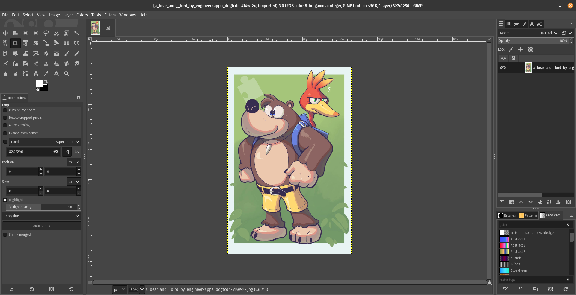
(Credits to a friend of mine for lettig me use the screenshots.)
My ideas on how GIMP can improve it’s UI
-
Adding the option of the new UI selected by default, but with the possibility to switch to the new UI.
-
Possibly addding “work spaces” like Krita would help too, along with the possibility of exporting and importing them, this way people can have custom arrangements of the UI according to the kind of work they will do.
Thanks for reading and hopefully we can address this issue effectively.
Now admittedly I’m not someone who often uses drawing programs, but my biggest issue in GIMP is that I never seem to be able to find what I’m looking for.
In the two images you posted you can actually see an example of such a case. In Krita all the tools (or whatever you’d call them) in the bar on the left are ordered in a logical way, and separate types of tools are also visually separated by separator lines. The bar with tools is also only 2 icons wide, which makes scanning for the right tool a bit easier, since you can mostly just scan along the vertical axis. In GIMP it’s just a pile of low contrast icons in seemingly random order. Unless you’ve used it enough to know the order, you’re gonna have to do a lot more searching. And searching will be way harder since you’ll have to search horizontally and vertically.
It’s like reading a website where the text is taking the whole with of the screen and without paragraphs (GIMP) vs reading a website where the line length is constrained, the text is horizontally centered, and there are proper paragraphs.
I feel like this example reflects my personal experience with both. I’ve used quite a few different types of image editing programs, and with most of them I can fairly easily find the stuff I need. Using GIMP however, I used to be quite lost. Nowadays it’s gotten better because the windows are not all floating around and I’ve used it more. But still, I only found Krita after using a fair bit of GIMP, and yet I felt instantly more at home because the UI was easier to navigate.
Edit: That being said, GIMP is a very cool program. I don’t want to hate on it too much. It’s helped me countless times. The UI has already improved a lot since the floaty window days, and I hope that continues.
For me all the things you said about GIMP, but my biggest issue is how layers work in it. It is totally unintuitive to me. Last week I tried to edit some simple image in GIMP, basically pasting some small objects and touching them up. I couldn’t get it to work properly, and would probably have redone it in Photoshop if it was to be used by more than three people for a short period.
Changing icons to color helps me find which ones I’m looking for. Seems weird it defaults to it looking like they’re greyed out because they won’t work on the current selection.
Dude, you can put the tools on the same way as Krita, just look at this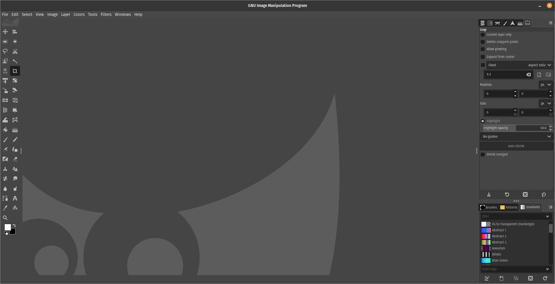
That’s the key. can. It needs to not suck by default. If people have to tweak the program to be usable first then nobody’s going to want to use your program.
The deal is, it’s not mine, it’s a Libre Software, so it belongs to everyone, not just me.
That’s cool. I’m not going to fix software I don’t like.
no one asked you to?
Can, but not by default. The default setup is what leaves an impression on most users. Most users opening GIMP for the first time expect to be able to find stuff that they need, not have to first spend a lot of time getting familiar with all of its options. It shouldn’t be needed to first spend time opening all the sane default windows and re-aliging stuff every time you boot it for the first time. At least, that shouldn’t be the case of GIMP wants to be as popular with non-technical users like Krita is.
Also, the tool bar still doesn’t have the nice separations between tool functions, and it still feel a bit more chaotic. Not sure of it’s the icons or the order.
I hate it when people are SO quick to judge and so superficial
You call it “quick to judge and superficial”, but imo that’s the wrong attitude. Every tool we use as humans should be designed to be as intuitive as possible. It makes it easiest for people to learn how to use a new tool. That doesn’t mean that a tool cannot be complex or customizable, but the default experience should make it easy for new users to quickly achieve something. Once they grow accustomed to the tool they can tailor it their own way.
No tool has to do this, but if it wants to be widely used then this is kinda necessary.
There’s a reason why there are whole fields of study into human media interaction, and why software companies hire UI designers. Everything that doesn’t have to be explained in words and text because it is intuitive saves mental overhead for the user and makes the application more accessible.