Edit: I have since realized that I am unsure on the calculation of tax burden is calculated for the chart.
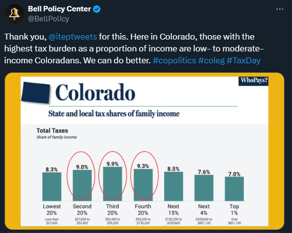
I am skeptical of the representation of the data. My sense for ways to skew data is set off when making statements of segments of population when the segments are not comparable.
I would need a better understanding of the calculation of the values reported to be able to justify that the top 20% are split into smaller groups than they’re being compared to.
You can easily lump them together again and see that it would add up to 8.2% for the top 20% incomes. I think they’ve made subdivisions to highlight that it’s skewed even within that group, with the richer people having a lower tax burden.


Edit: I have since realized that I am unsure on the calculation of tax burden is calculated for the chart.
I am skeptical of the representation of the data. My sense for ways to skew data is set off when making statements of segments of population when the segments are not comparable.
I would need a better understanding of the calculation of the values reported to be able to justify that the top 20% are split into smaller groups than they’re being compared to.
You can easily lump them together again and see that it would add up to 8.2% for the top 20% incomes. I think they’ve made subdivisions to highlight that it’s skewed even within that group, with the richer people having a lower tax burden.