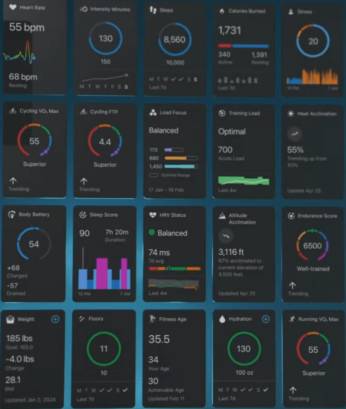
How are we feeling about the update to the app (for those that use it)?
Its been a week and I’m still getting used to it.
Meh. Same same but different. I’ve had it for a while now and don’t think it is any better or any worse. The thing I dislike the most is that they moved having a “tray” type pop out menu and now you click more in the bottom right.
That never has and still doesn’t sit right with me. The rest, the information is there it looks OK. It is alright.
It’s an improvement, been using it for a while as a tester. I don’t know why there’s a hard limit of 20 in the at a glance section but whatever
It adds the functionality to plan your own workout routes, which is a killer feature if you ask me. Can’t do that on Strava without paying €€€ for their overpriced subscription
I hopped on the beta and while the default layout after I did the questionnaire was terrible, I eventually got it to the point that I like it better than before.
It makes it easier to pay attention to some stats that matter to me more, and the small graphs in the In-focus section give me some quick insights on how I’m doing in various capacities. It’s definitely not perfect and maybe could have spent a little longer cooking in beta, but overall I like it.
I still hate the activity summary screen. The old design, with some basic numbers in the three circles in the middle beneath the map, looked great, had better information density, and looked unique. The new one looks bland and generic, and has oodles of wasted blank space.
It saddens me that somebody over at Garmin got actually paid designing that.
$brand did $thing and $metric is more/less (choose one) visible. I am engaged.


