No, it’s not phishing, it’s legit, the header match with google and the link goes to https://accounts.google.com/AccountChooser/signinchooser?continue=https%3A%2F%2Fadmin.google.com%2Fac%2Fac%2Falert%2Fdetails%3FalertId%3D3…
Why not just write the message there instead of letting me login to watch the important notification???
The content of this “important notification” is that to remind me that on January 18, 2025, they will delete the data of Google Currents, because they killed it. I even didn’t know what that product was.
google currents sounds like some sort of phenomenon, like an ocean current that pushes stuff onto the shore where we discover it.
Google Currents is the Google strategy of “The Less Products I Have The Better”
Google Currents
They probably just renamed it to Google Raisins.
So many things have died. GOOGLE KILLS.
Goodbye Chromecast!
Hello, thing that’s totally not Chromecast.
At least the protocol is still alive.
last remnant of google+ apparently
They know my name, yet they wrote “Dear Google Workspace Administator” as the most generic phishing attempts.
I doubt more than 6 people at Google knew what it was.
Yeah actually, any non-spam email should always address you by name and that’s a rule. Many services also have this in their e-mail footers “This e-mail is for XXXXX” etc. because a typical mass sent garbage mail won’t know your name.
When I worked the email marketing opt out queue I relied heavily on the “this email was sent to [email address]” because 9/10 reports that the opt out didn’t work, they had setup forwarding from one email address to another
Were you expecting a Google employee to notice the issue, think “Uh oh, I better let Moonrise know about this!” and type out an email for you?
Email templates are ubiquitous and can easily insert names and any other variable.
Do you know that’s trivial to write a marketing email like
“Dear <name placeholder>…”
I get that Google is just a startup with limited resources and can’t afford expensive marketing tools, but this is a basic feature offered in every marketing email software, even free ones.
The reason is that a phishing scammer usually just got a leaked/stolen email list without names, and by stating “dear <name>” they show that it’s not a phishing.
Once you train users that generic emails with “click here to read the message” are legit, then phishers have an easier life.
In this specific case they’re just announcing that a Google service that nobody was using has been killed (as is tradition) and they’re going to delete the data, there’s no reason at all to have a “click here to read”.
It’s also annoying that Microsoft sends links via sms using a really scratchy looking domain (aka.ms). Turns out they’re legit
They got the
.microsoftTLD a while back specifically for this purpose. Supposedly they want to migrate all their cloud services there, but I learned about that a year ago and I’ve only seen it in use once since (IIRC on Loop…)And let’s not forget about facebookmail.com, the official mail server for Facebook login notifications since 2004.
The tech is here, the risks are enormous, but the corpos don’t care because they don’t bear the costs of phishing attacks and governments are too impotent to enforce minimum standards of cybersecurity.
Their latest iteration of Teams runs on https://teams.cloud.microsoft.
Looks like that works but my bookmark is on https://teams.microsoft.com and there’s no redirect whatsoever. Hopefully they’ll get there in a few months’ time.
went to that link, “Oops, app failed to init!”, considering that this is public-facing, that is a very bad error message
i write better error messages than fekking MICROSOFTmaybe it’s supposed to be really rare, but i just visited the site
edit: turns out DARK READER broke it!!!
I had to make a police report yesterday, and they wanted me to upload evidence. The (text) message they sent was along the lines of: “A. Last name requests evidence from you. Click here to submit evidence. vp.au/evidence”
dear sirs, please submit the evidences to do the needful, very thanks.
vp[.]au seems to be sketchy, just blank + sketchy js running
But there are so many dodgy similar looking ones that auto complete if you’re typing it.
I went to type in the aka.ms to find a bit locker recovery key. And didn’t realise it autocorrected to something like akam.ms and it was a super sketchy site about bit locker recovery. Luckily I realised straight away even MS wouldn’t host a website like the one I saw.
Link shorteners are the worst.
Only reason I knew that was akamai was their hosting for their previous ISO distro system, it does look phish af.
A good rule of thumb is to never click on links in emails. Always go to the domain manually.
I can see why they would want that. They may consider email to be inherently less safe than their platform, so they don’t send any sensitive information there.
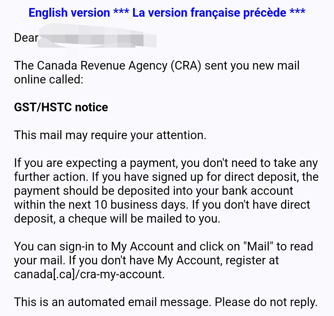
Canada’s government stuff also generally works that way, except without any links.
I’m not sure how legit their concerns are, but it’s a thing.

In fact a lot of things do:
- My bank
- All monthly work pay notifications
- All tax notifications
It’s just normal to not include the actual information. But like you say, except sometimes the bank, they don’t include links.
Public services here do that too. But they then use a known local service for that.
Reminds me of when Malwarebytes changed the interface to look like a straight up virus. LOL, we were all shitting bricks.
we have not been delivering what customers expected, in fact, we were delivering the exact OPPOSITE. now is time for that to change.
Had the same reaction to this email today!
It is better than the vendors/contractors who send emails with misspellings and attached documents
I debated signing in multiple times myself, finally got it validated for a feature that was never enabled. Fuck off Google


