

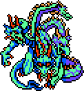
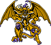
These are just like, the most important bosses. A lot of the regular enemy sprites are so nice too. Like just, what they did with such limited hardware. So nice.
Kazuko Shibuya, the artist behind these, is incredible. Pretty sure she actually made all the pixel art for FF1 (including the iconic bridge scene and UI) as I don’t think there was another pixel artist available at the time.
Oh I didnt know the name behind it thats awesome! I knew that for these fix specific sprites they were translated from Amano’s original artwork shockingly faithfully for such a transition, but didnt know the name of the person who actually did the work. So talented!
I know! I love pixelart so much. The OG Gameboy sprite artists were working on another level with their limitations
Yeah I get very passionate about pixelart. its a skill I want to learn. You dont happen to know a good Youtube tutorial or something for that do you? I gotta look into that.
deleted by creator
WonderSwan Color, my beloved
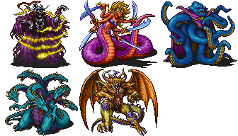
Yeah the evolution of the sprites across different platforms and versions is also really interesting. Primarily the originals vs the standard set by the wonderswan verisons (even though the fandom wiki has the PS1 and GBA versions ripped, which is fine because theyre basically the same), the PSP versions, and then the Pixel Remaster versions. Ive been reviewing them in a private discord to like two other people lmao <3 These are definitely all good.
But I’m especially interested in the originals just because of what they pulled off with the hardware yaknow?
One thing I’m endlessly fascinated why is how they used CRTs and lossy cables to create detail and transparency
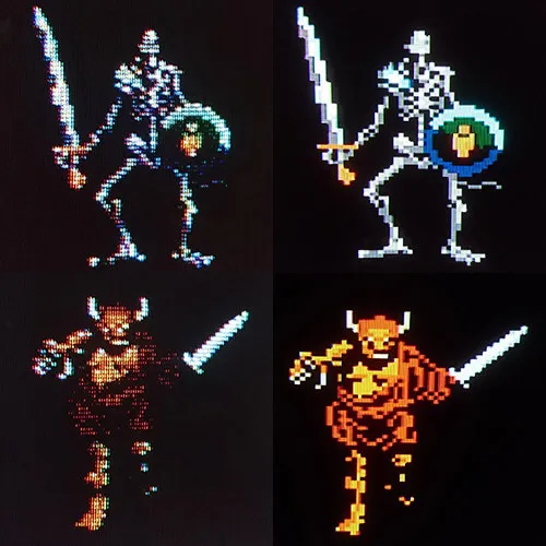
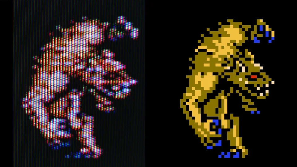
How tf do you do this?
Thats so fucking cooooooool.
Some more neat examples in this video. Legit the first hit on YouTube, so not some hidden gem, but it’s got some mesmerizing examples. The only ones I didn’t find compelling were the 3D examples towards the end (except for the transparency effect @9:34), but those are a small part of the video and out-of-scope for this pixel art discussion anyhow.
I found a YouTube link in your comment. Here are links to the same video on alternative frontends that protect your privacy:
deleted by creator
The sprites improve greatly between all 3 nes games plus the charm in the animations is great.
This is one of the reasons i am so fucking disappointed with lot of modern “pixel art” games. Compare with old games like that and suddenly a lot of it came as in best case from low budget and at worst as outright lazy.
Yeah they rule. I actually think the regular enemies are even better. Tons of great designs, great silhouettes, great poses, way more shading than you should be able to get out of three colors. Rarely the first thing you’d think of if you sat down to draw the thing in question either, they just ooze style.
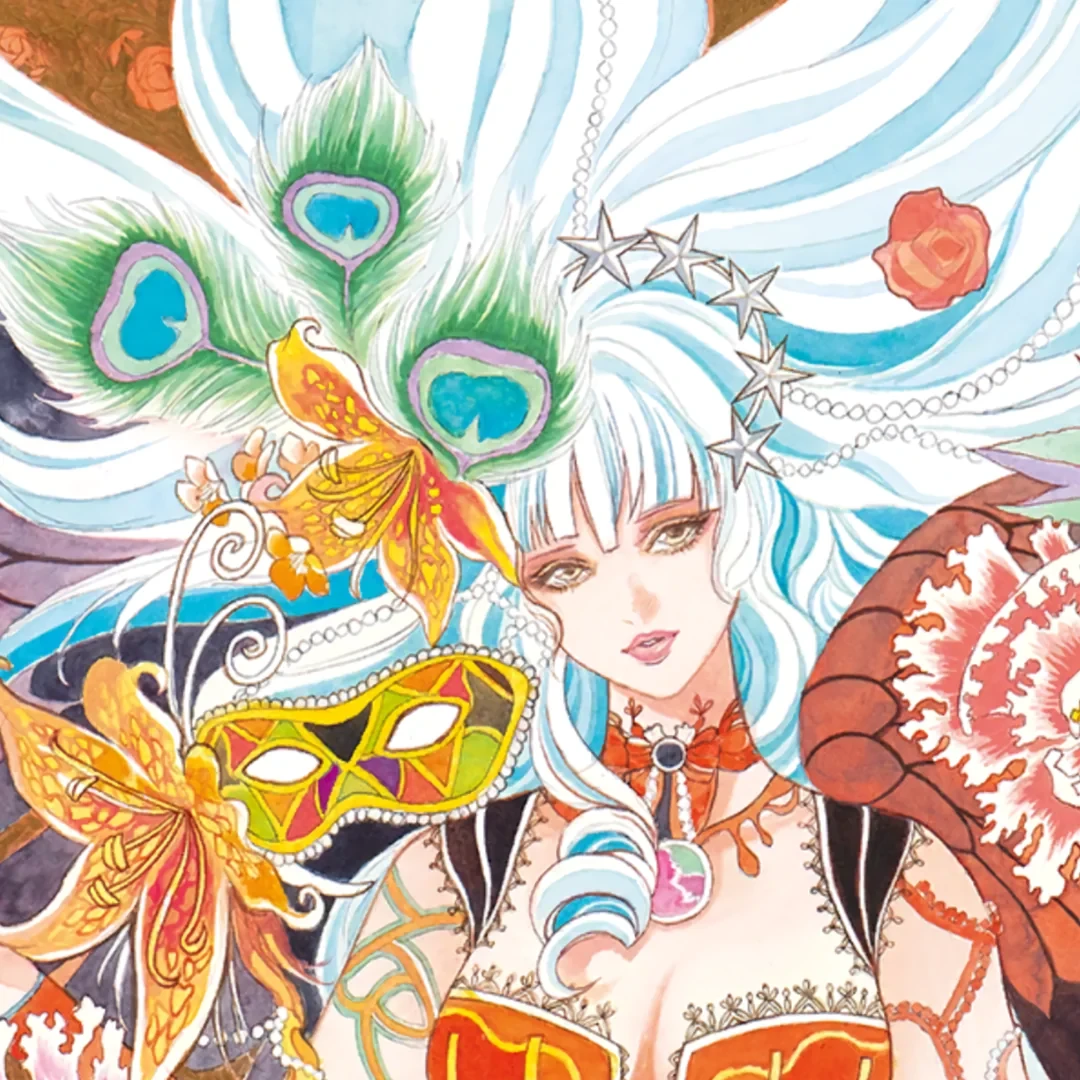
I looked up Kazuko Shibuya’s later work and apparently she did monsters for Terra Battle (who has ever heard of this) and she’s still got it. Look at these random monsters I got from clicking around on that wiki


Oh man this looks neat I should loo-
Terra Battle was a free-to-play mobile game
😔
Some art that absolutely slaps has been made for those games to be fair.
Wow yeah she DOES still got it.
I hate that it’s impossible to translate this level of artwork into a 3D game short of cel-shading (and I hate FF type gameplay)
3D art comes with unstated assumptions that it’ll also be animated, respond well to lighting changes, and look good from arbitrary angles. It’s really just a ton more work than people give it credit for. Also all the toolchains suck compared to 2D ones.
That game was new when I was a kid, and yes, those boss sprites were impressive.
Fun trivia fact: some of them had to be changed for the western release because they were too close to D&D IP monsters, like the Beholder.
Kind of rich that Illithids stayed but were called “WIZARD” and “SORCEROR.” The “does 1 damage or kills your character” thing from the SORCEROR stayed without the mention that it was supposed to be a brain-eating attack.
Are these actually sprites or drawn on the background layer?
In terms of, like, the NES rendering, the enemies and bosses in FF1 are rendered on the background layer. Colloquially, people tend to call any chunk of pixel art a sprite.
