- cross-posted to:
- videos@lemmy.world
- history@lemmy.world
- cross-posted to:
- videos@lemmy.world
- history@lemmy.world
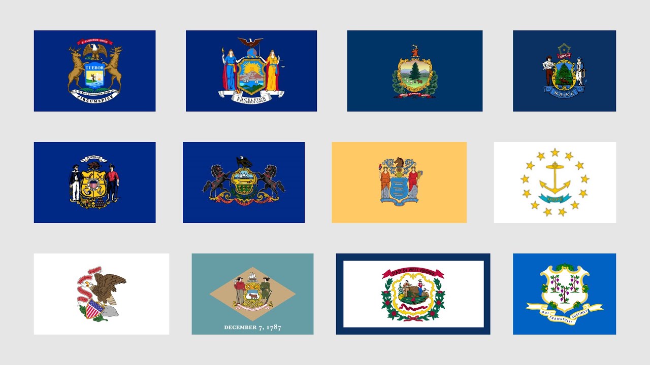
It seems very strange for him to say that the Good Flag Bad Flag author fails to justify the rule that the flag should be simple literally immediately after showing a slide with a paragraph of justification for that rule. Especially since the next part he speaks about illustrates it extremely well - even if I know that Pennsylvania’s flag is the only one with two horses, how am I meant to recognise the two horses when the flag isn’t laid out flat as an image? I can always tell apart the Nordic ones because the differences are huge simple blocks of colour that I only need to see a tiny part of to recognise and which extend all the way to all four edges. I can’t do that with two black horses on a dark blue field.
Yeah I tend to agree. He says being able to recognise it doesn’t matter and that it being simple enough for a child to draw is irrelevant. I can see his point with the latter, and I think he makes a good point about how people have made allowances for flags like the US flag but not others. But I also think the ones with seals or coats of arms really go too far, to the point that they often genuinely cannot be clearly distinguished if looked at on a flagpole from a distance, among a number of other flags, when the wind isn’t blowing. Because that’s the situation that a good flag design should be clear.
It seems to me like he got fixed on the specific example of “a child should be able to draw it from memory” when the point of that is more “it should be simple, and it should be easy to recognise even if the details are off - as if a child had drawn it from memory”. Whichis perhaps a fault of the writers of the pamphlet trying to be a bit too pithy, I don’t know
“Flag snobs”. LOL.
For reference, the two-sided Oregon flag, proper, is $19 on Amazon.
https://www.amazon.com/dp/B07HPCZ8L3
Cheap Chinese single sided flag? $5.
https://www.united-states-flag.com/oregon-3ftx5ft-printed-polyester-flag.html


