Hey, here is the final update for 06/24. Below is a list of all changes that were made:
- Performance enhancements. Button presses should no longer have a delay.
- Preloading of images. You shouldn’t see nearly as much delay between images loading while scrolling unless you’re on a potato connection in the middle of the ocean.
- Non-markdowned links should take you to the appropriate places. If someone posts /c/memmy@lemmy.ml, it will be linked to the community.
- User profile links now take you to the user profile.
- Fixed a crash on first login.
- Fixed NaN error whenever replying to a post or comment.
- Image modal is highly improved. It should be significantly faster to swipe around and should be much easier to dismiss with a swipe.
- Most images will now take up the full space. There appear to be a few issues with this from early reports and I’ll look into them more tomorrow.
- Haptic feedback is fixed when replying to comments.
- Fixed issue where video audio would continue playing in the background after closing the browser.
- Fixed issue where accounts would be reset if you made a bookmark.
- Fixed comments not collapsing at times.
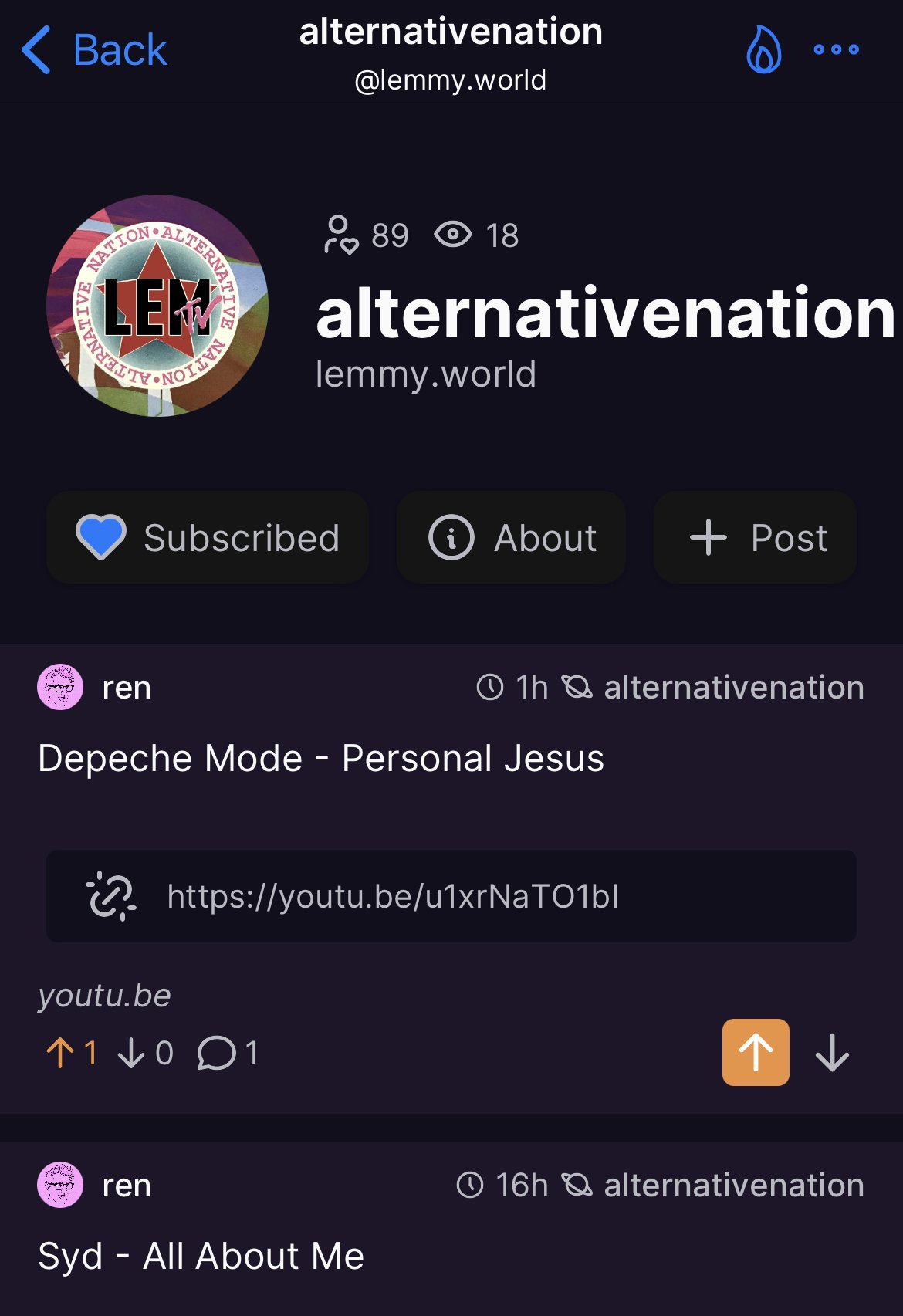
- Adjusted themes. This is a work in progress. If there are any issues here let me know and we will address them (color theme is slightly change, but will be improved upon. We are getting ready to allow users to submit their own themes to have added into the app. We will let you know whenever this is available and how to submit your themes on GitHub)
- User profile page has been redesigned. This will be more full-feature in the coming day or so, including saved posts, upvoted posts, and recent history. Right now, only 50 comments and 50 posts will load. This will be converted to infinite scroll shortly.
- On that note, OTHER users profiles will be converted to this view tomorrow.
- Font should be larger now and SHOULD scale appropriately regardless of device. If you are having issues with really terrible font sizes, please reach out and we’ll look into it.
Big thanks to ALL of you for your continued feedback and support through this development process. You guys make this enjoyable.
I’ve been super focused on making sure that performance is a top priority in the app. I test on lower end devices to make sure things run smoothly, and I’ve already ironed out a couple of issues that lead to poorer performance. Please let me know if you experience anything at all that seems slugish or slow.
Also, expect a bit of a treat in the next update :)
Until next time, Happy scrolling!
Dude you are absolutely killing it.
Do you sleep??
Memmy just keeps getting better. Thank you for all your hard work.
No we don’t let him
Thank you for the work you are doing, currently I think it is the best lemmy app on iOS. Keep up the good work. In the future, do you think it is possible to include an integrated translation mode?
I’d need to look into what APIs are available for this. As long as something is free (or at least free enough, I.e. some number of requests per day) it’s something I could definitely do in the future.
Just saw what Apollo does for this, and it’s something I could easily integrate. I’ll think of the best way to do it.
Best lemmy app for sure. And I tested them all!
Yooooooo Memmy! that Purple theme is looking reeeeeal good! Nailed the color. Any chance we’ll have youtube preview/thumbnails or the ability to play a youtube clip in app?

I’m surprised that everyone likes the purple theme since I put it together in under a minute. It was just to test how well the interface looked when themed. I’ve got a much nicer purple theme and many more on the way
Can’t speak for others, but I’m tired of the black / grey dark mode interfaces.
On Mastodon with Mona I could make any color I wanted and made a slightly reddish navy.

A touch of color is refreshing for dark modes these days (imo).
Have some more themes coming in the next update as well.
Amazing to see how fast this app progresses. Keep up the good work! Also a small request: could you add automatic dark/light mode switching based on system systems?
You’re absolutely killing it. Memmy is the best of all the iOS apps I’ve tried so far. Thank you for all your efforts.
Still not able to view my profile page, all it says is “That content or community was not found”. Any tips?
Love the app. You guys are hustling for sure! I would also love to see a “system” default theme so I don’t have to switch between light and dark themes.
Thanks for building the app!
Question for the group: how are you all “hiding” content you’ve already seen? I keep scrolling back to the top and manually doing a pull-to-refresh, but I keep seeing the same posts over and over because there’s no way to hide read, or is there??
Also, anyone else’s profile page say “That content or community was not found”?
Don’t have an answer to the first part of your question, but yeah the profile page still doesn’t work for me.
Holy crap, I just downloaded this and it’s so much better than Mlem (as of right now, most of the features about Apollo are in this app, Mlem has not caught up yet.)
I especially love the Search feature! I used that on Apollo TOO MUCH to find relevant information across all of Reddit about an obscure topic.
I thought this was going to give me ‘Save’ on swipe left but my phone screen wasn’t wide enough :)

Don’t worry I’ll be getting some new features in there soon :)
Don’t forget to eat.
Hi! Thanks for bringing quick updates. You’re killing it.
Apologies if this has already been suggested or planned, but have you considered offering language options? I’m bilingual and would love to help make a Spanish locale for Memmy.
Keep up the good work!
Thank you! I love the new dark theme!
Unfortunately, I still need my glasses, since this update didn’t fix my astigmatism.
Also just wanted to say thank you! Awesome app and I’m hoping you’ll get to 1.0 soon and release it to get paid for all the quality work you have been doing.
Testing /u/gif at /c/memmy
Testing reply
Testing reply
Thank you!


