
cross-posted from: https://lemmy.capebreton.social/post/347724
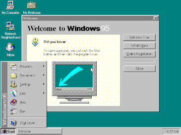
Windows 95 is a consumer-oriented operating system developed by Microsoft as part of its Windows 9x family of operating systems. The first operating system in the 9x family, it is the successor to Windows 3.1x, and was released to manufacturing on July 14, 1995, and generally to retail on August 24, 1995, almost three months after the release of Windows NT 3.51.
Windows 95 is the first version of Microsoft Windows to include taskbar, start button, and accessing the internet. Windows 95 merged Microsoft’s formerly separate MS-DOS and Microsoft Windows products, and featured significant improvements over its predecessor, most notably in the graphical user interface (GUI) and in its simplified “plug-and-play” features. There were also major changes made to the core components of the operating system, such as moving from a mainly cooperatively multitasked 16-bit architecture to a 32-bit preemptive multitasking architecture, at least when running only 32-bit protected mode applications.
Accompanied by an extensive marketing campaign,Windows 95 introduced numerous functions and features that were featured in later Windows versions, and continue in modern variations to this day, such as the taskbar, notification area, and the “Start” button. It is considered to be one of the biggest and most important products in the personal computing industry.
Dear god, my biggest beef with using a smart phone is that UI designers 1) love to have tiny buttons for shit, and 2) the tappable areas for those buttons are almost never made larger than their tiny graphics, so it’s a bitch to actually tap them.
I used to be a mobile app developer, and when I wrote apps by myself I would always expand the tappable areas so they were easy to hit with fat fingers. My last job was working for a huge cable company (maybe the name rhymes with “bombast”) and whenever I expanded the tappable area of a tiny button the UI designers would pitch a fit and insist that that not be done. Management would agree with them on the grounds that expanding the tappable area would require too much time to implement - and then they’d order me to spend even more time un-implementing it.
I find this problem to be especially pronounced in the exit buttons on in game ads.
Something that irritates me in desktop design is, there’s a clickable icon. There’s no box around it to represent a button, just the icon on a blank background. You move your mouse towards the icon. When you get close to the icon, a box appears around it. You take this to mean “this object will be interacted with when you click the mouse.” You click the mouse. Nothing is achieved. You have to move the mouse into the actual borders of the icon, it’s just that now icons get visibly excited that you might pick them.
Windows 95 legitimately had better UI than that “Material” bullshit, via relief shading conveyed through four fucking colors. The hierarchy of elements is instantly visible. Buttons even popped in and out when clicked. There’s just no excuse for how minimalism fetishists have taken over user experience.