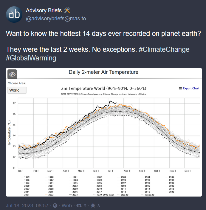
Yeah, you’re right. It would be even more obvious now if it were redone. I specifically like that one because it invites people to scroll through the time axis slowly and on a linear scale. It makes the recent changes more real than the same graph fitted to a screen and seen all at once.

Yeah, you’re right. It would be even more obvious now if it were redone. I specifically like that one because it invites people to scroll through the time axis slowly and on a linear scale. It makes the recent changes more real than the same graph fitted to a screen and seen all at once.