

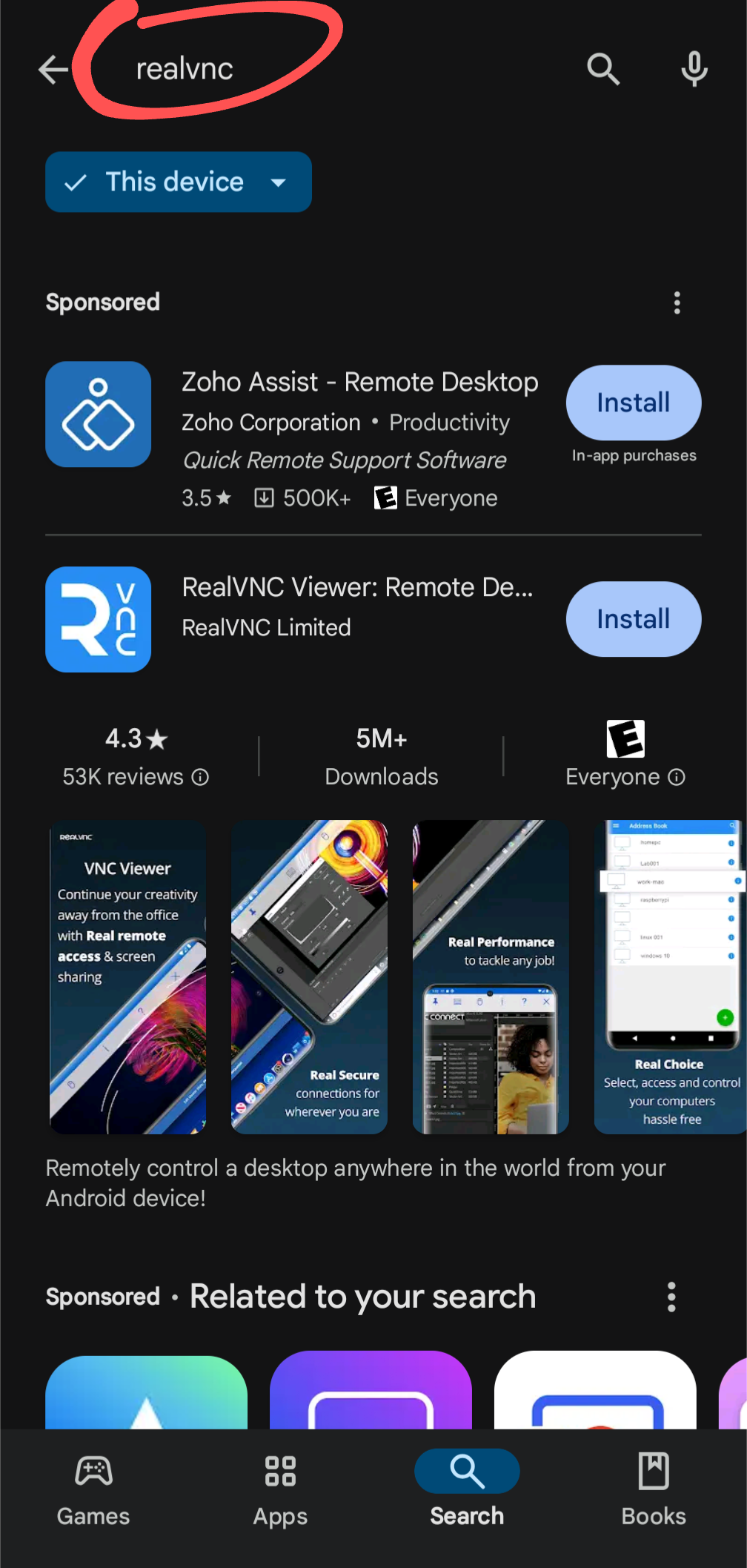
I asked a relative to look for RealVNC on the Play Store and install it. Once they were done, I asked them to fulfill a basic task inside RealVNC and they were really confused by my instructions. I took a look at their phone, lo and behold, they had installed a different app. I asked them to repeat the install procedure while I watched. They punched in “realvnc” in the search box, two identically formatted results appeared. Their finger instinctively clicked the Install button on the top result. It was an ad. 🤦♂️🤦♀️🤦
Uhhhh no they didn’t. I mean unless you mean “identically formatted” the way every app in the Play Store is.
One is an advertisement, and labeled as such.
As someone who’s seeing this Play Store search result page for the first time, I also find it massively confusing.
Frankly, it looks like just the description page of RealVNC with an info box for “Zoho Assist” at the top (which might be the team that develops RealVNC?), and for some reason there’s also two install-buttons.
You don’t have a chance to realize that it’s a list of search results, because there’s practically no repeating UI elements.
Aside from the sponsored app at the top (which I also don’t find clearly labeled; that “Sponsored” could just be a generic heading above everything), I don’t even assume malicious intent from Google here.
Presumably, they made the RealVNC entry big, because they don’t want you falling for scam apps. But it is absolutely not helpful in this case.
Now squint just a bit. That’s how everyone without perfect vision sees it, and that’s a huge proportion of people.
Also, this is how other results appear:
No Install buttons.
E: Not sure why this image doesn’t show but in any case, app results in lists don’t have Install buttons. Hm apparently it only doesn’t show on mobile.
I don’t doubt lots of people make that mistake, but ya can’t fix stupid. The only thing they can do is remove the ads entirely, which they probably should, but definitely won’t, but that is a different conversation.
Removing the Install button from the ad would eliminate this issue in most cases. There, I fixed stupid. I’ve done UX btw, some of it on Android.
You haven’t fixed anything, you’ve just made it more difficult to install the advertised app.
I aimed to make it more difficult to install the advertised app by accident, which was the original problem. You seem to agree that my design change would achieve that. 😂
My point is there is no way they can make it any more clear without making the advertised app harder to install, which is counter-productive. If your concern is that having advertised apps at the top of the search results makes people more likely to click on them, yes, everyone knows, and that is the intent.
Tell your relative to pay more attention to what they’re installing. That’s the only solution here.
Everyone here knows everything you said. I’m merely providing a current example of where things are today and I’m making a moral judgement that this design has become too counterproductive for the user. Not sure if you stand on the other side of this and if you do, that’s fine. You may have your reasons to support Alphabet’s corporate interest. I don’t in this case. Therefore I feel it’s justified to make things less productive for Alphabet. You suggested nothing can be done other than removing the ad altogether. I suggested a way to solve the issue I highlighted without removing the ad.
I understand your concern. I absolutely don’t support alphabet LOL. I don’t even use the Play Store. I just don’t think they can shoulder 100% of the blame here and I think your description of “two identically formatted results” is disingenuous. The two apps do not share a name or a description. The closest thing is that they have a similarly-colored icon.
The screenshot you are showing is scrolled down the page past “More results”. What you are showing is after all of the actual search results (which for me is just the app and no ad).