Dot isn’t a dot, dot is in the wrong place, the shape of the blob is different.
Bordiga-level pedantry. It’s true that the dot is “in the wrong place” when comparing the pictures, but did you know that you can actually view the island from any side? As for the island shape, the four-pointed design is distinct, where of course there will be differences with the slime stylization.
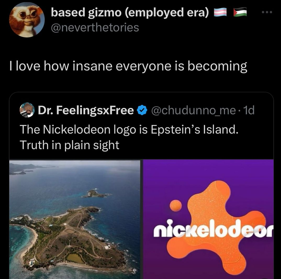
The logo is OBJECTIVELY roughly based on Epstein’s island, either due to the designer’s trips to the area (purely for snorkeling) or their Paul Atreides-esque dreams of the future of the company. It could also be that mother earth formed the island itself around the logo design in order to signal the issues within both entities, but humanity ignored this warning. And now here you are like a heretic yelling “he cannot be Lisan Al Gaib, as there are small differences between reality and how it was written,” confusing prophecy and symbolism for perfect recreation.
Ehhhh I’m not seeing it. Even if you ignore the little island and rotate them around it doesn’t really match. It’s a blob with four points but that’s about where the similarities end. The curves are different, the size of the “points” are different.
Here’s the logo rotated and overlapped on an image of the island from google maps:
I’m rotating and scaling it around but I can’t make it work.
edit: there’s a level of irony going over my head isn’t there
You rotated the blob dishonestly. It’s like someone having two images of a square and rotating one diagonally then overlapping them and saying “look, they don’t line up!”

Bordiga-level pedantry. It’s true that the dot is “in the wrong place” when comparing the pictures, but did you know that you can actually view the island from any side? As for the island shape, the four-pointed design is distinct, where of course there will be differences with the slime stylization.
The logo is OBJECTIVELY roughly based on Epstein’s island, either due to the designer’s trips to the area (purely for snorkeling) or their Paul Atreides-esque dreams of the future of the company. It could also be that mother earth formed the island itself around the logo design in order to signal the issues within both entities, but humanity ignored this warning. And now here you are like a heretic yelling “he cannot be Lisan Al Gaib, as there are small differences between reality and how it was written,” confusing prophecy and symbolism for perfect recreation.
Ehhhh I’m not seeing it. Even if you ignore the little island and rotate them around it doesn’t really match. It’s a blob with four points but that’s about where the similarities end. The curves are different, the size of the “points” are different.
Here’s the logo rotated and overlapped on an image of the island from google maps:
I’m rotating and scaling it around but I can’t make it work.
edit: there’s a level of irony going over my head isn’t there
Truth in plan sight.
Patriots in the thread know what’s going on.
Someone make an animation where the blob rotates and morphs into the island
You rotated the blob dishonestly. It’s like someone having two images of a square and rotating one diagonally then overlapping them and saying “look, they don’t line up!”
I’m an honest blob rotator I swear
Let my blob be clear.
I wanna hear about Dog Island
Oh no you don’t.
No dogs?
let’s just say that dog island is the exact shape of the cartoon network channel logo. 👁️ㅤㅤ
👁️ㅤㅤ
Here comes the “I can rotate 3D shapes in my head” vs the “I can’t rotate 3D shapes in my head” debate.
it’s a pretty wild debate tbh
Plato is spinning in his grave, in my head.
This is the most powerful comment I’ve ever read