Mozilla has overhauled its branding to pay homage to its Netscape roots and better distinguish the wider organization from its Firefox web browser. The most notable change is to the company’s logo: what was previously a sans-serif wordmark styled as “Moz://a” has been updated to correctly spell out the Mozilla name, featuring a new customized typeface and an M-shaped flag.
According to Mozilla, the flag symbolizes the brand’s “activist spirit.” That fits with the image that the Mozilla Foundation, which is leading the company, is attempting to build: describing itself as “a non-profit organization that promotes openness, innovation, and participation on the Internet” and regularly releasing privacy reports that investigate tech companies’ policy and security practices.
Yep, that’s what it needed. A new look. Definitely not new management. Just a new look.
I wonder which ad agency come up with this brilliant hand-washing propaganda after all the shit Mozilla grabbed since the new CEO was in.
Mozilla has become a mockery of its former self, so fair enough. “Activist spirit” my ass.
I like the Moz://a branding, altough most people wouldn’t get it, so it makes sense to switch to correct spelling.
Whether the T-Rex is the coreect choice, is another question. I do like that it feels more creative than the basic, reduced logos of today.
Edit: I do like the new Logo. It looks good and it does match its “activist spirit”. Mozilla the corporation is different from the foundation, and I do believe, that Mozilla is closer to its roots than all other browser vendors - including the reskins of Chromium.
I’m guessing, based on some older blog posts, that the Moz://a logo feels like a fan favorite because it was, in part, chosen by fans.
I didn’t know it was chosen not even 10 years ago, as it felt like it could’ve been around for longer.
It’s a T-Rex? I always thought the old logo was a play on Godzilla, because the name Mozilla was similar.

Wikipedia says that, yes, it was originally a play on Godzilla, and also green, back when it was still internal to Netscape.
When they started setting up the Mozilla Foundation, a new design was created, of a red T-Rex.
If I ran it I’d rename the dinosaur to T-rexiera
I saw a discussion on HackerNews where one person claimed a rebrand is “almost always a sign of distress”, which seems far more speculative than informative. I tried looking it up, and while distress might be one possibility, it’s only one of many. Some companies might think their logo is outdated, and choose to update it. That might be especially true for tech companies, where style changes rapidly.
Another possibility I saw was that companies will change branding when they are trying to change direction. Apparently the Steve Teixeira layoff was actually more about AI and Mozilla Social than I had anticipated (he was pushing against AI, apparently, and mozilla.social was his baby), so this might coincide with a full embrace of AI or some other change.
ETA:
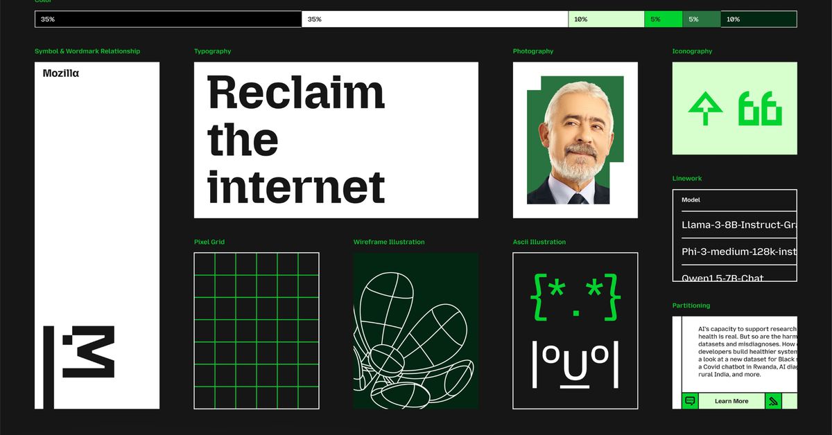
Mozilla is using a mix of saturated green, pink, and orange (with the latter acting as a subtle nod to the popular Firefox browser) to inject a pop of color against a white or black base.
Does anybody see pink or orange? All I see are black, white, and shades of green.
I tried to look up the Mozilla Foundation page announcing this, but it looks like they just gave interviews announcing the change. Phrases like “activist spirit,” “grassroots to government,” “tech with a cause” (paywall), and the perennial “reclaim the internet” ring a little hollow now.
One more tidbit: the previous Mozilla logo was sort of crowdsourced, Mozilla called it “our logo journey”. This one, by comparison, was between Mozilla and the agency that commissioned.
It’s a real shame the process for the previous logo wasn’t followed again. I liked the previous logo, too.
Is it just me, or is it strange that everything is conventional pixel art (all perfectly level squares at right angles) except for the M?

Goddamn lock ness monsta

Glad to hear they’re focusing on the really important things.
Wow, decisions were made with those new fonts. 😬