- cross-posted to:
- hackernews@derp.foo
- tesla@lemmy.world
- cross-posted to:
- hackernews@derp.foo
- tesla@lemmy.world
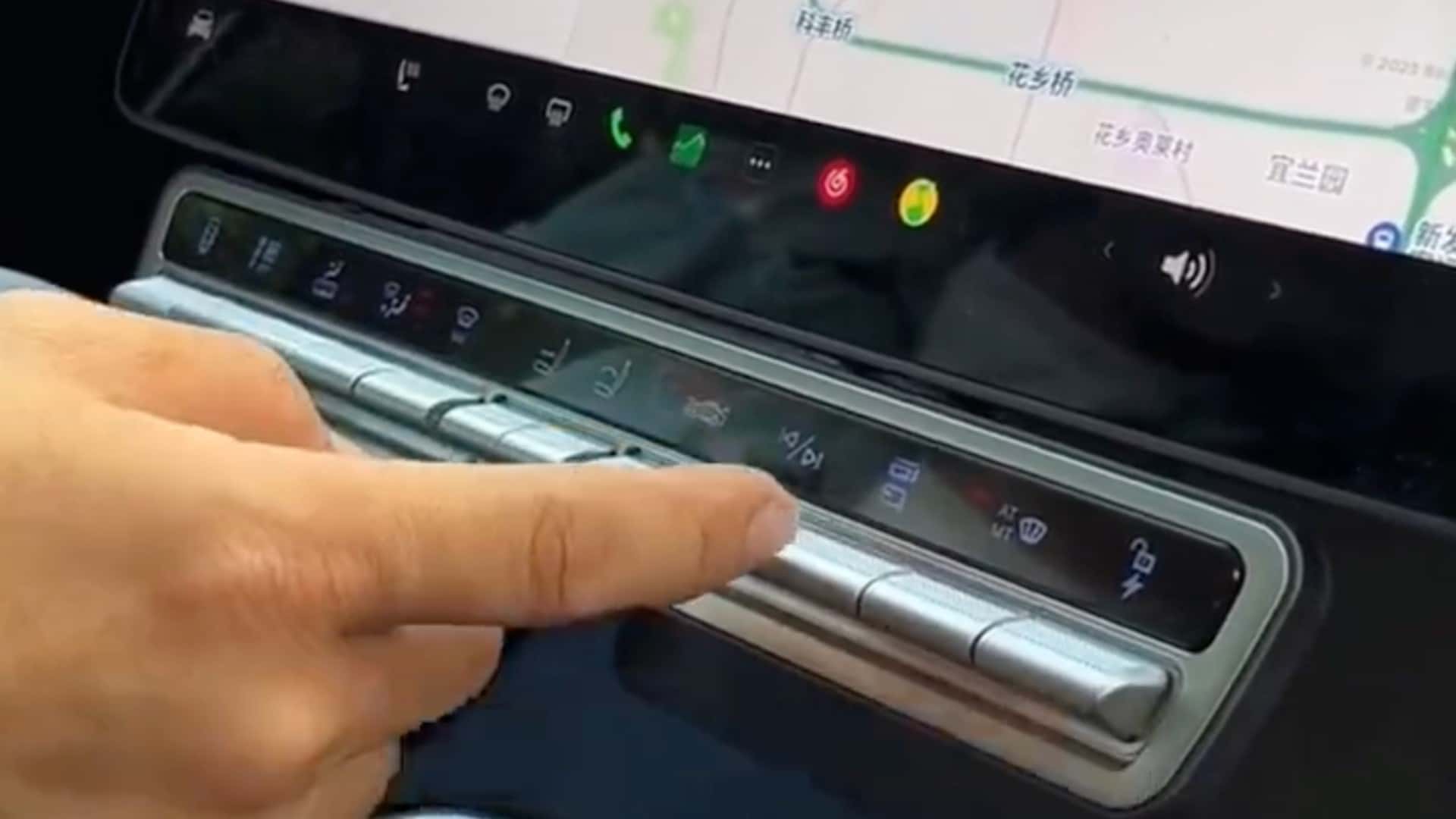
Tesla Model X Owner Has Had Enough Of Minimalism, Adds Physical Buttons::Tesla Model X owner from China has attached a panel of physical buttons to the vehicle’s main control unit for quicker access to some key functions.


Lots of cars today have this touchscreen nonsense for controlling everything.
By 2016, even Honda/Acura started using it on higher end models. Which is funny, because my early 2000’s Honda has nice, big, obvious, easy-to-use-without-looking AC controls.
Yeah, I was just looking at the modern version of my current car. Seems like it does still have 1 row of buttons. But most stuff seems to be on a teslaesque tablet.
My current model (from 2014) l has a lot of stuff you can do in the menu system, but anything you need to do while driving has controls on either the stalk or dashboard.
Oh and the current car has a touch screen radio and THAT is annoying on its own. So many times I want to just press a different station shown on the screen. Oh, you wanted to select that station? Well I thought you swiped and now I’m on a random page of stations you don’t want to listen to. Good luck getting back while driving!