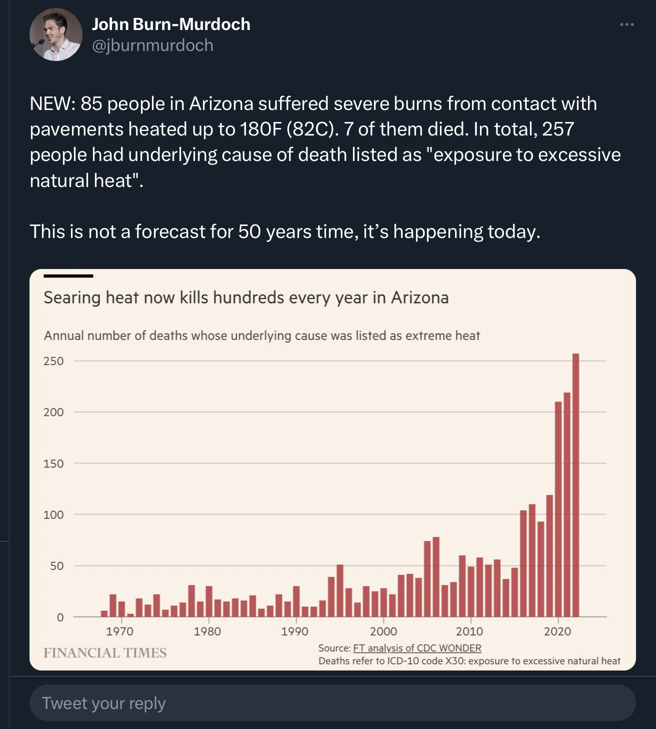
As an analyst, this pissed me off. There’s like an oath to never fudge, misrepresent, or be selective with data to manipulate the viewer. We collect raw data for the purest source of fact. It is a single source of truth.
Just a quick Google on one of the glaringly obvious misrepresentations in this graph, and AZ’s population in 1970 was 1.77M; it is now 7.36M. Displaying this graph more truthfully would still highlight increased temperatures impacting increased rate of death to heat, but not at all dramatically, so the creator has misrepresented. Then there’s a lot more to factor in for proper analysis. Healthcare rate with growth? Infrastructure for the same? Why just Arizona?
Climate change science has fact and figure on its side. There is not need to misrepresent it like deniers do. Doing so dilutes and damages the cause by denying the one thing it has, truth.
Exactly. I stumbled across this report from the AZ Dept of Health which breaks it down into per 100k people and the data still supports the author’s point. The report then goes on to divide up the population by age, residents vs visitors, county, etc.
Hell, the FT author could have just included a plot of the population growth, which was pretty linear. Not great, but better than nothing.
Grinds my gears.