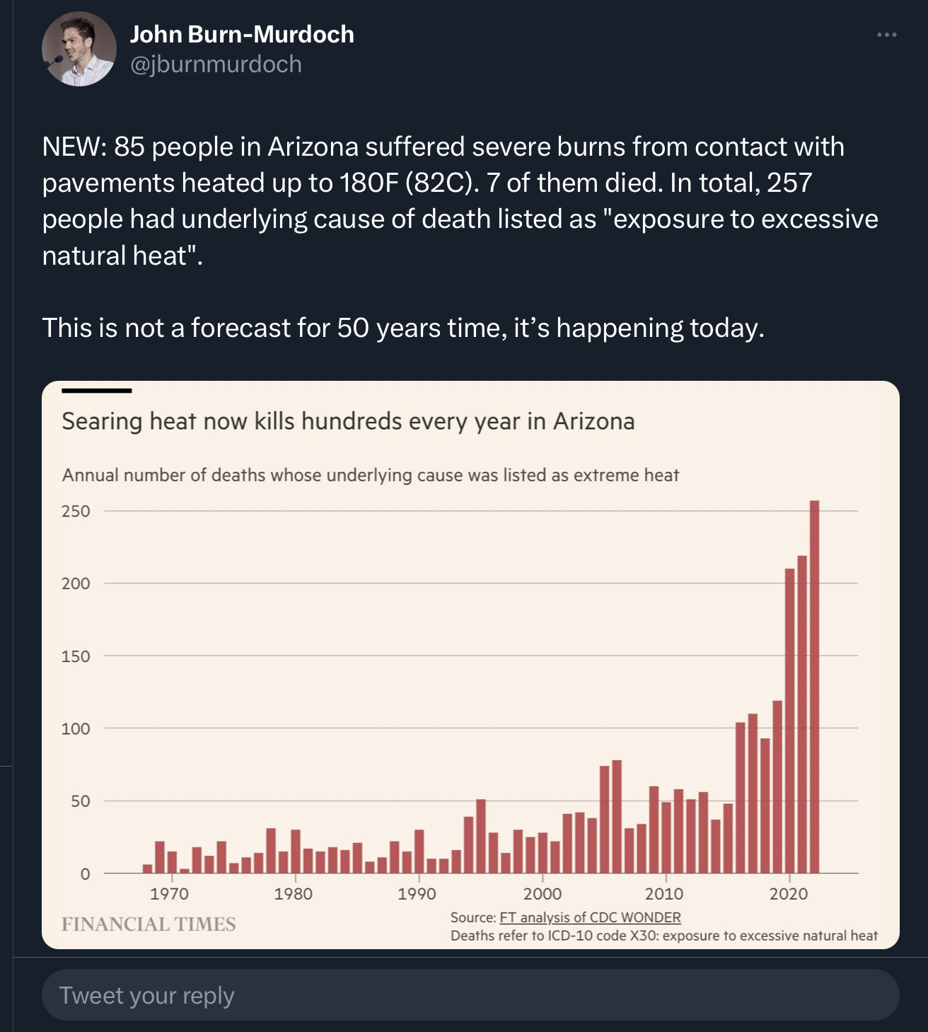
Here’s a version scaled by population (deaths per 100,000 residents). I’m no expert in this kind of thing, so I didn’t account for other factors, such as age groups. Also, the data I found using the source in the original graph only went up to 2021, and didn’t include 2017 for some reason.
Yeah, that looks more reasonable. The original graph makes it look like there have been ~5x the number of deaths in the last few years compared to ~10 years ago. Adjusted for population growth, it’s ~2-3x.
That’s still really concerning and makes the point the article was making, while being much more accurate and defensible when scrutinized. Thanks for that!