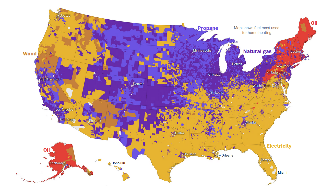
Seriously this map (top especially) is… C- at best; I know elementary teachers that would fail this on the spot. Why not just list the colors in a ‘label’ box? Why are there two shades of purple? What about yellow and dried-poo yellow-brown? (if you argue ‘it’s the color they appear’, electricity isn’t yellow and oil isn’t red…) Why is there a text blurb in essentially 12pt font hiding in the great lakes/canada instead of double+ the size and at the top, centered? Why are some state capitals on the map - and in the worst color contrast possible (see: why are there two purple colors…). Also, why are they in like 10pt font? Why is oil listed twice?
For a display of just 5 items, this is pretty awful.
I also have to question the accuracy of it all, especially since plenty of homes up north use multiple sources (e.g. natural gas furnace and wood fireplace)
RIGHT? It’s almost like it was designed to make you puzzle over it for longer than you should have to. The second image is easier to digest-- It’s labeled properly, and you can sort of tell that areas would overlap.
First one could be redeemed with a little bit of information hierarchy, but it’s pretty obtuse as-is.


How do you heat your home?
Honolulu.
Seriously this map (top especially) is… C- at best; I know elementary teachers that would fail this on the spot. Why not just list the colors in a ‘label’ box? Why are there two shades of purple? What about yellow and dried-poo yellow-brown? (if you argue ‘it’s the color they appear’, electricity isn’t yellow and oil isn’t red…) Why is there a text blurb in essentially 12pt font hiding in the great lakes/canada instead of double+ the size and at the top, centered? Why are some state capitals on the map - and in the worst color contrast possible (see: why are there two purple colors…). Also, why are they in like 10pt font? Why is oil listed twice?
For a display of just 5 items, this is pretty awful.
I also have to question the accuracy of it all, especially since plenty of homes up north use multiple sources (e.g. natural gas furnace and wood fireplace)
RIGHT? It’s almost like it was designed to make you puzzle over it for longer than you should have to. The second image is easier to digest-- It’s labeled properly, and you can sort of tell that areas would overlap.
First one could be redeemed with a little bit of information hierarchy, but it’s pretty obtuse as-is.
Why are 2 of the options purple? There are so many colors to pick from!!!