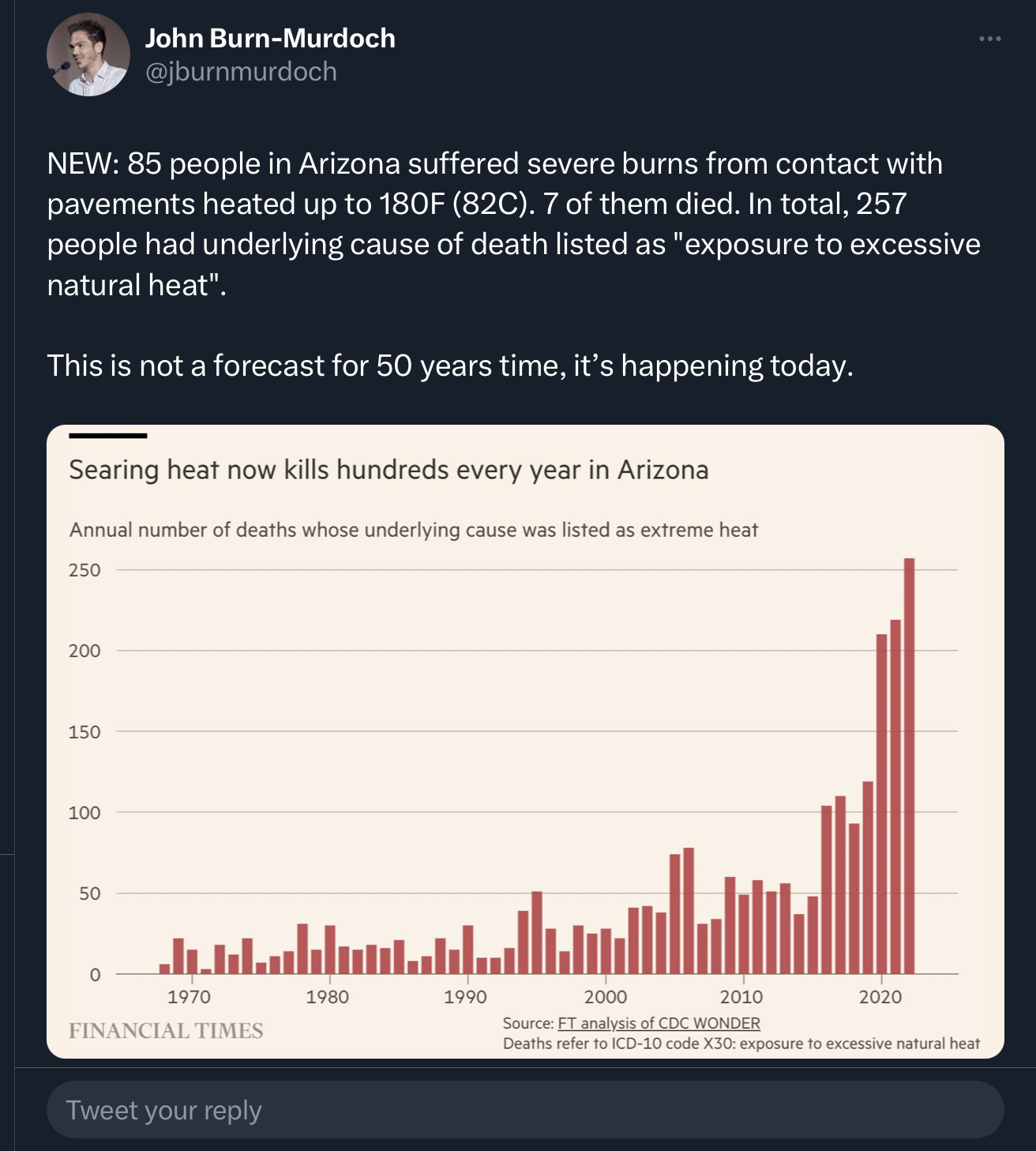
I’m 110% on board with global warming, but this graph is misleading.
The author needs to at least correct for population changes (heat deaths per X residents). Even better would be to account for changing demographics, like age and county. From this random stats website, it looks like there has been a dramatic increase in proportion of older residents since 1970. Old people are more likely to die, so more elders = more deaths.
If I wasn’t about to head to bed, I might try to fix it, but… sleep.
Oh, and I’m pretty sure there has been an increase in small plane crashes in AZ. The hot air is much thinner than most pilots are used to, so they tend to forget accounting for changes in thrust and climb rates. I’m pretty sure a couple happened in just the last few weeks.
And whenever you have a chart of historical data like this, you have to at least consider that an increase could be reflective of either improved diagnostic or record-keeping abilities.
More like you just died from old in 1970, versus acute heat stroke in 2023.
I say this being fully on board with the climate change. Charts like this serve little purpose when you don’t properly adjust for the myriad changes that have occured over the last half century. And before anyone says “you mean like global warming,” no, don’t account for that one, because that’s what we’re trying to see.
Yeah, it can be as simple as the death certificates requiring only a primary cause of death.
Old man collapses from a heart attack while trying to change a tire on a hot desert road? Cause of death: heart attack. If more details are requested, they could probably get away with just claiming age-related health issues. The guy is dead, no foul play, the case is closed.
Very much this, and especially over this period. More universal diagnostics, more emphasis on secondary causes and contributors, etc.
And it works the other way, too. Fewer people should die per capita based on faster EMS response times, better medicine, more urban living, etc.
The big one for me is age. I never really heard of people retiring to Arizona until the late 90s. It was always Florida before then. The over 50 crowd is 36% now vs 23% in 1970.
yeah, people lose so much credibility when they don’t even control for simple easy things.
there will always be some confounding factors, but doing rate per population, is rarely hard - andneeded over decade comparisons.
demographic risk adjustment is more complex, so i’d not expect that. but if it is at least acknowledged, then the article is more credible and will get more (of my) attention.
media (and i guess their audience) seem to enjoy hype though . . .
oh shit this is the f.t. i used to think they were among the more credible journo’s. pity.
Shouldn’t we be doing more about increasing heat related deaths, even if it would be primarily caused by more people becoming vulnerable to it, or more people living in the zone that is dangerous?
I agree. And shit like this makes me trust financial reporting in general. It’s akin to not accounting for inflation in financial graphs.
And yes, the risk adjustment can be as complex as they want to make it, but when I clicked, I was expecting a study of some type. Probably my bias kicking in. My first thought was, “Are they kidding?” Then I saw it was from a news source and thought, “Oh, okay… no wait. Still, they know this is bad, right?”
As an analyst, this pissed me off. There’s like an oath to never fudge, misrepresent, or be selective with data to manipulate the viewer. We collect raw data for the purest source of fact. It is a single source of truth.
Just a quick Google on one of the glaringly obvious misrepresentations in this graph, and AZ’s population in 1970 was 1.77M; it is now 7.36M. Displaying this graph more truthfully would still highlight increased temperatures impacting increased rate of death to heat, but not at all dramatically, so the creator has misrepresented. Then there’s a lot more to factor in for proper analysis. Healthcare rate with growth? Infrastructure for the same? Why just Arizona?
Climate change science has fact and figure on its side. There is not need to misrepresent it like deniers do. Doing so dilutes and damages the cause by denying the one thing it has, truth.
Exactly. I stumbled across this report from the AZ Dept of Health which breaks it down into per 100k people and the data still supports the author’s point. The report then goes on to divide up the population by age, residents vs visitors, county, etc.
Hell, the FT author could have just included a plot of the population growth, which was pretty linear. Not great, but better than nothing.
Hmm, but a big part of the problem here is that vulnerable places like Arizona are also those seeing such high population growth. I’m not sure correcting for that would make the graph “better”, it would just show something different.
I’m not advocating for better or worse. In the end, the data shows what it shows. I’m just saying that there was essentially no “analysis”, making any interpretation inappropriate.
Hey, more people should survive, thanks to newer medical treatments and more concentration of populations around cities.
On the flip side, there’s a larger portion of the population that’s older and from out of state.
In between there’s the chance that the threat of heat-related health problems should be much diminished due to widespread access to air conditioning. But, that also means more people haven’t had first hand experience with heat exhaustion/stroke, and don’t realize how quickly things can go from kinda bad to dead.
Here’s a version scaled by population (deaths per 100,000 residents). I’m no expert in this kind of thing, so I didn’t account for other factors, such as age groups. Also, the data I found using the source in the original graph only went up to 2021, and didn’t include 2017 for some reason.
Yeah, that looks more reasonable. The original graph makes it look like there have been ~5x the number of deaths in the last few years compared to ~10 years ago. Adjusted for population growth, it’s ~2-3x.
That’s still really concerning and makes the point the article was making, while being much more accurate and defensible when scrutinized. Thanks for that!
rates. I’m pretty sure a couple happened in just the last few weeks.
I’ve heard of articles saying that global warming is already leading to more air turbulence and that it is only going to get much stronger by the mid century
Yes. Hot air is thinner, so there’s less lift on aircraft wings. There’s actually a conversion they’re supposed to use that basically says, 'At this temp, treat the plane as if it’s actually at this other, much higher, altitude."
Here’s one of the recent videos I’ve seen mentioning it (around 5 min in they mention the “density altitude”). I’m not a pilot and just find the stuff interesting.

I’m 110% on board with global warming, but this graph is misleading.
The author needs to at least correct for population changes (heat deaths per X residents). Even better would be to account for changing demographics, like age and county. From this random stats website, it looks like there has been a dramatic increase in proportion of older residents since 1970. Old people are more likely to die, so more elders = more deaths.
If I wasn’t about to head to bed, I might try to fix it, but… sleep.
Oh, and I’m pretty sure there has been an increase in small plane crashes in AZ. The hot air is much thinner than most pilots are used to, so they tend to forget accounting for changes in thrust and climb rates. I’m pretty sure a couple happened in just the last few weeks.
And whenever you have a chart of historical data like this, you have to at least consider that an increase could be reflective of either improved diagnostic or record-keeping abilities.
If we stop testing we will have 0 cases!
More like you just died from old in 1970, versus acute heat stroke in 2023.
I say this being fully on board with the climate change. Charts like this serve little purpose when you don’t properly adjust for the myriad changes that have occured over the last half century. And before anyone says “you mean like global warming,” no, don’t account for that one, because that’s what we’re trying to see.
Yeah, it can be as simple as the death certificates requiring only a primary cause of death.
Old man collapses from a heart attack while trying to change a tire on a hot desert road? Cause of death: heart attack. If more details are requested, they could probably get away with just claiming age-related health issues. The guy is dead, no foul play, the case is closed.
AKA the conservative COVID strategy.
Finally, someone gets it. We just need to ban thermometers.
The libs are making us slaves to those damn thermomasters! They better not take away my freedom to boil off those 3 remaining brain cells!
Very much this, and especially over this period. More universal diagnostics, more emphasis on secondary causes and contributors, etc.
And it works the other way, too. Fewer people should die per capita based on faster EMS response times, better medicine, more urban living, etc.
The big one for me is age. I never really heard of people retiring to Arizona until the late 90s. It was always Florida before then. The over 50 crowd is 36% now vs 23% in 1970.
yeah, people lose so much credibility when they don’t even control for simple easy things.
there will always be some confounding factors, but doing rate per population, is rarely hard - andneeded over decade comparisons.
demographic risk adjustment is more complex, so i’d not expect that. but if it is at least acknowledged, then the article is more credible and will get more (of my) attention.
media (and i guess their audience) seem to enjoy hype though . . .
oh shit this is the f.t. i used to think they were among the more credible journo’s. pity.
Then lets ask the other way round:
Shouldn’t we be doing more about increasing heat related deaths, even if it would be primarily caused by more people becoming vulnerable to it, or more people living in the zone that is dangerous?
I agree. And shit like this makes me trust financial reporting in general. It’s akin to not accounting for inflation in financial graphs.
And yes, the risk adjustment can be as complex as they want to make it, but when I clicked, I was expecting a study of some type. Probably my bias kicking in. My first thought was, “Are they kidding?” Then I saw it was from a news source and thought, “Oh, okay… no wait. Still, they know this is bad, right?”
Still gets those nummy clicks, I guess.
As an analyst, this pissed me off. There’s like an oath to never fudge, misrepresent, or be selective with data to manipulate the viewer. We collect raw data for the purest source of fact. It is a single source of truth.
Just a quick Google on one of the glaringly obvious misrepresentations in this graph, and AZ’s population in 1970 was 1.77M; it is now 7.36M. Displaying this graph more truthfully would still highlight increased temperatures impacting increased rate of death to heat, but not at all dramatically, so the creator has misrepresented. Then there’s a lot more to factor in for proper analysis. Healthcare rate with growth? Infrastructure for the same? Why just Arizona?
Climate change science has fact and figure on its side. There is not need to misrepresent it like deniers do. Doing so dilutes and damages the cause by denying the one thing it has, truth.
Exactly. I stumbled across this report from the AZ Dept of Health which breaks it down into per 100k people and the data still supports the author’s point. The report then goes on to divide up the population by age, residents vs visitors, county, etc.
Hell, the FT author could have just included a plot of the population growth, which was pretty linear. Not great, but better than nothing.
Grinds my gears.
Hmm, but a big part of the problem here is that vulnerable places like Arizona are also those seeing such high population growth. I’m not sure correcting for that would make the graph “better”, it would just show something different.
I’m not advocating for better or worse. In the end, the data shows what it shows. I’m just saying that there was essentially no “analysis”, making any interpretation inappropriate.
Hey, more people should survive, thanks to newer medical treatments and more concentration of populations around cities.
On the flip side, there’s a larger portion of the population that’s older and from out of state.
In between there’s the chance that the threat of heat-related health problems should be much diminished due to widespread access to air conditioning. But, that also means more people haven’t had first hand experience with heat exhaustion/stroke, and don’t realize how quickly things can go from kinda bad to dead.
Here’s a version scaled by population (deaths per 100,000 residents). I’m no expert in this kind of thing, so I didn’t account for other factors, such as age groups. Also, the data I found using the source in the original graph only went up to 2021, and didn’t include 2017 for some reason.
Yeah, that looks more reasonable. The original graph makes it look like there have been ~5x the number of deaths in the last few years compared to ~10 years ago. Adjusted for population growth, it’s ~2-3x.
That’s still really concerning and makes the point the article was making, while being much more accurate and defensible when scrutinized. Thanks for that!
I’ve heard of articles saying that global warming is already leading to more air turbulence and that it is only going to get much stronger by the mid century
Yes. Hot air is thinner, so there’s less lift on aircraft wings. There’s actually a conversion they’re supposed to use that basically says, 'At this temp, treat the plane as if it’s actually at this other, much higher, altitude."
Here’s one of the recent videos I’ve seen mentioning it (around 5 min in they mention the “density altitude”). I’m not a pilot and just find the stuff interesting.
That was super informative, thank you.